

 Trade W
What is a Bar Chart?
There are two types of charts to depict price movement over time. One type of chart, called a bar chart, uses vertical lines (called bars) to show price movement over time. A bar chart shows four price points: open, high, low, and close. All components combined make bar charts great for tracking the changes in Forex price.
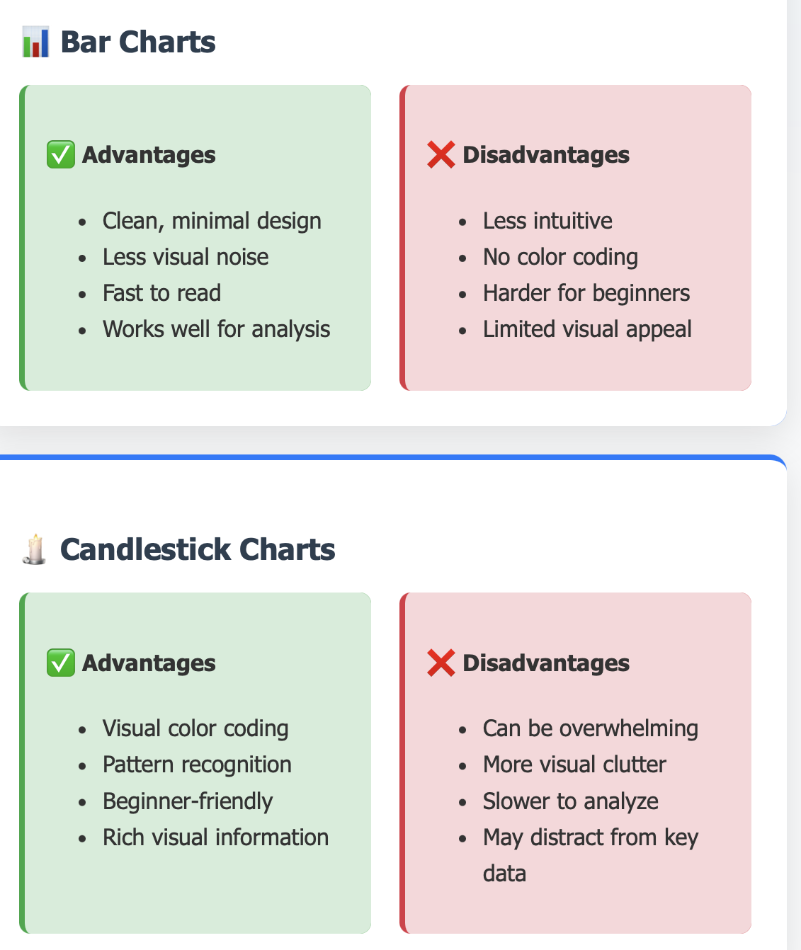
Bar charts differ from candlestick charts in how they visually represent price. While candlestick charts use a colored body to represent price direction, bar charts show only a simple vertical line with small horizontal marks. The left horizontal mark shows the opening price and the right horizontal mark shows the closing price.
Using bar charts allows Forex traders to recognize price trends and patterns, effectively identifying FUTURE price directions. The vertical line denotes the trading range between the highest and lowest price during a specified period of time (the period of time is also determined by the type of chart traders select). Bar charts work very well for any currency pair and time frames.
Take the daily chart for the euro versus US dollar (EUR/USD) currency pair. Each bar represents one trading day. A tall bar indicates high volatility (the price moved significantly). A low bar indicates low volatility (the price hardly moved).
Consider bar charts like watching fruit prices at the market. The highest price during the day will be at the top of the bar. The lowest price will be at the bottom. The opening price will appear on the left as a small line. The closing price will show on the right.
Bar charts are visual ways to view price behavior. Bar charts allow a trader to identify trends, reversals, and periods of randomness in the market. Professional traders utilize bar charts for technical analysis of markets and timeframes.
Bar chart components
Understanding bar chart components is important for effective technical analysis. The high is the maximum price reached during a time period. The low is the minimum price reached. Together, the high and low form the vertical line of the bar.
The open price indicates where trading opened for that period. It will be a small horizontal line extending to the left of the vertical bar. The close price indicates where trading closed. This will be a horizontal line extending to the right of the vertical bar.
The difference in distance of high and low prices will provide an indication of volatility in the market. A larger high/low price range would indicate a lot of activity, and a larger distance price movement. A smaller high/low price range would indicate lower market activity and consequently lower price action.
Use the GBP/JPY chart in the 1- hour time frame to help you see the trend. Notice some strong upward bars, where they close near the high, with their open being near the low, showing that there is some buying pressure. You can see the downward bars, where they close near the low, and open near the high, which shows some selling pressure.
Now think of a thermometer that monitors daily temperature, the highest temperature is equal to the high on the bar, and lowest is equal to the low on a bar, with the morning temperature equal to the open and the evening temperature equal to the close.
The anatomy of a bar chart allows us to visual these components and infer market sentiment. Bars that close near their high show some bullish momentum, while bars that close near their low indicate some bearish pressure. The relationship between these components can provide us with significant insight when it comes to trading.
Professional traders will review the components of a bar before they make their trading decision based on market sentiment, being able to measure the distances between the highs, lows, opens and closes can create a deeper understanding of market psychology and inform us in which direction price is possibly heading in the future.
Timeframes and Bar Charts
Various timeframes are available for when we trade; each time-frame serves a specific purpose or strategy. Shorter timeframes such as 1 minute and 5 minute charts are used to relay intraday price movements. It helps day traders find profit within the same day and manage their risk.
Longer timeframes, including daily and weekly charts, show the larger market picture. Swing traders and position traders rely on longer timeframes to make strategic decisions. The timeframes will impact decision making and risk management.
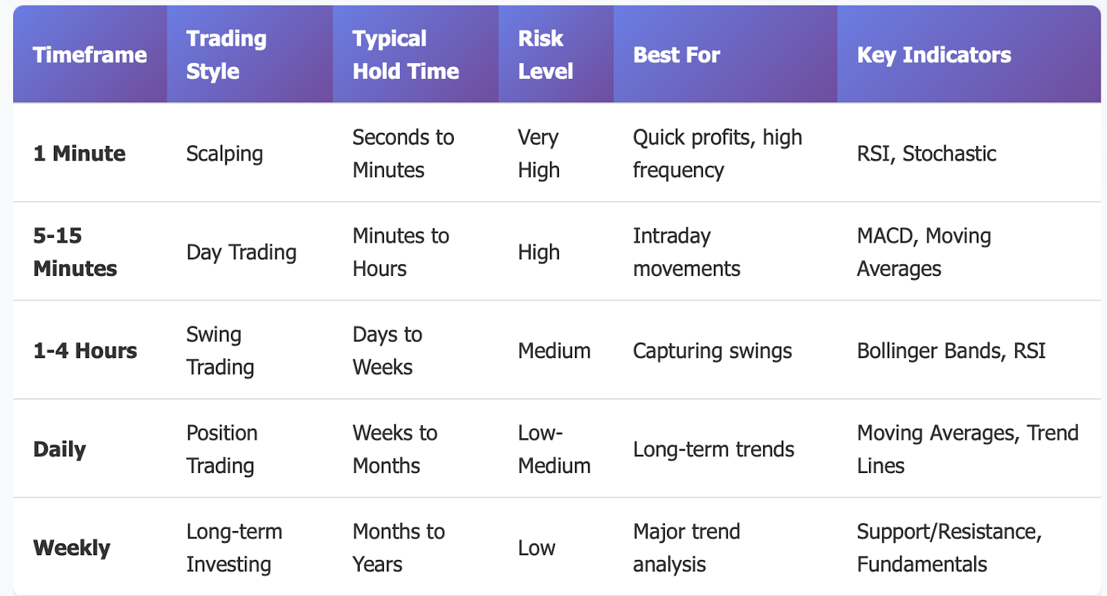
Scalpers prefer a 1-minute chart in order to trade rapidly. Day traders will make trades on 5-minute and 15-minute charts in order to get a larger perspective of the market. Swing traders like to use hourly and 4-hour charts. Position traders mostly just rely on daily and/or weekly charts.
Of course, you can use a 5-minute EUR/USD bar chart to get an idea of intraday price movements during active periods. Each bar represents 5 minutes of price action. You can also use the 5-minute chart to pinpoint short term support and resistance levels.
Think about how bus arrival times at stations operate to help with the context of timeframe cycles. Each hour that goes by is another bar timeframe. You have a better detailed picture of what is going on using a shorter timeframe. You have a broader picture but with less detail on longer timeframes.
Analysing multiple timeframes can improve the efficacy of your trading. You can look at the higher time frames for longer trends and then use the lower timeframes for more precision on entry or exit. In closing, analyzing multiple timeframes means you can reduce trading risks and time your trades better.
Lastly, while intraday trading can help traders make better trades, timestamps are unique. Different market conditions may determine if intraday trading is necessarily better than positional trading. For example, periods of high volatility may enforce the need for shorter timeframes, thereby taking more control of the volatility, while, contrarily, periods of low volatility may collaborate with longer timeframes in order to "capture" price movements.
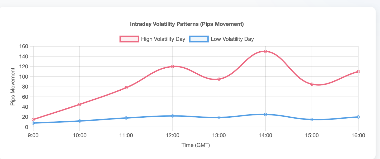
Trading style dictates appropriate time frame choice. Aggressive traders prefer shorter time frames. Conservative traders prefer longer time frames. By using a time frame consistent with trading personality, consistency can increase and emotional stress can decrease.
Bar Charts and Indicators
Technical indicators help bar charts by analyzing the market in other ways. Moving averages smooth price action and define if market actions are in the context of an up-move or down-move. Generally speaking, prices typically continue in an up-move if trading above its moving averages. If trading below its moving averages, prices generally continue to be in a down-move.
The Relative Strength Index (RSI) is a measure of momentum built from the bar chart. The RSI is defined as 70 and above is overbought, 30 and below is oversold. Traders can use these to signal potential reversal points in the market.
MACD is a moving-average-based trading signal. Whenever the MACD line crosses the signal line above the signal line, it can signal a buy opportunity. Conversely, when the MACD line crosses the signal line below the signal line, then it should signal a potential sell point. These signals normally collaborate well with action occurring on bar charts.
Bollinger bands provide dynamic support and resistance areas surrounding bar charts. A price touching the upper band exhibits the market's overbought conditions. The floor of the lower band exhibits oversold conditions. These bands will help to determine entry and exit points in the price move chart.
Combining bar charts with candlestick analysis creates a complete picture of the market. Point and figure charts clean up market noise from the bar chart market data. Heikin-Ashi charts will minimize bar chart volatility making trend identification easier.
Using bar charts with MACD on the EUR/JPY chart can identify trend reversals. If MACD starts to diverge from price action, expect trend reversals to happen. Look closely at the histogram as that will show the strength of the momentum behind the price action on the bar charts.
When we think of performance, we think of running pace and heart rate. Pace is similar to price movement representing the bar chart data. Heart rate represents the level of effort or stress that is experienced within the technical indicators. Running pace and heart rate combined in a single analysis represent a more complete picture of performance.
Professional Day Traders will consider layering bar charts with many indicators. Oftentimes, this provides us with confirmation, alerting us to possible internal and external trending of the stock market. The major benefit of layering is it decreases the amount of false breaks, reversals, and reversals. The challenge is combining indicators can limit our decision making and cause "analysis paralysis". Finding a competent and reasonable way to layer indicators will take time and experience.
Advanced Use: Bar Charts in HFT & Algo Trading
High Frequency Trading is based on Bar Chart analysis in real-time market data. Algorithms can analyse thousands of bars per second in order to seek profit opportunities. After learning bar charts and building a trading system, the frequency of bar chart updates will dictate our ability to react to competitive stock market signals.
Bar charts are used as input signals for algorithmic trading systems. Price breakouts from bar chart patterns trigger the algorithmic systems to trade on their own. Volume spikes combined with bar chart formations are used to confirm trade signals. Algorithmic trading systems can execute trade faster than a human trader can react.
Commercial EUR/USD 1-minute bar charts provide insight into HFT volatility patterns. Algorithms can identify bar formations that statistically have an edge or larger probability of being profitable. Price gaps between bars can identify when liquidity is an issue. High-frequency trading systems dynamically change position sizes on bar chart volatility.
Machine learning systems use historical bar chart data to identify price formations and for pattern recognition. Neural networks can locate bar chart formations that are statistically predictable and can be profitable. They adapt to changes in market conditions through automated learning. The bar chart patterns become features in predictive models.
An analogy to help understand algorithmic trading refers to the stock monitoring of a vending machine. The vending machine monitors stock inventory levels just like we monitor prices using a bar chart. When the stock is below acceptable levels, the vending machine will automatically trigger an order. This is no different than the logic in which many algorithmic trading systems operate.
Latencies of time impact bar chart data processing, particularly in a high-frequency environment. The faster the data is processed, the more competitive it is. Generally, colocation services minimize the time that bar chart data has to travel. Microsecond improvements mean large differences in profit potential.
Risk management algorithms in automated trading systems use volatility from the bar charts to restrict the size of positions taken. When volatility is high, bar chart trading systems will automatically reduce the size of the position. Bar chart volatility is lower and it will provide much larger positions in the market. This will maintain risk posture in all market conditions using positions in multiple instruments.
Bar charts afford the opportunity to backtest algorithmic strategies. By reviewing historical data, one can ascertain a trading system's level of effectiveness. Additionally, monte carlo simulations are able to test a system's robustness. In totality, all these methods can confirm a series of successful trades for an algorithm using historical data, then implemented in forwarding testing scenarios (live).
Market Psychology Represented in Bar Charts
Bar chart shapes correspond with trader emotions and sentiment. Long bars downward may factor in fear due to their length in distance - panic sold positions are a factor in location in space (up) to down). Longer bars upwards may factor in greed and the ability to put in orders of euphoria (which certainly envelops all traders as common experience across many bars). The psychology moves prices and the patterns presented in the bars reflect that in space and time.
Doji's happen at no change - opened = closed. Long upper wicks show sellers rejected higher price levels. Long lower works demonstrate buyers showing support at lower price levels. The price stays, which reflects the underlying psychology in the market at that given moment.
Volume accompanies the emotional response as represented in the bar chart when intervals of activity take place (high bottom volume indicates high emotional response/sell); low volume gives the indication that little or no interest in that bar occurred (but things can change).
Combining the volume responses with the associated bar could enhance understanding of possible emotional weighting or severity associated with that bar (attributed to volume and combined shape).
News events release emotion on traders, and through bar shapes represent those emotions in a tangible way to view on price charts. Economic releases create volatility spikes that could be visualized in long bar formations and gap events. Central bank announcements create long directional bars. Political events produce uncertainty reflected on bars that show considerable choppiness.
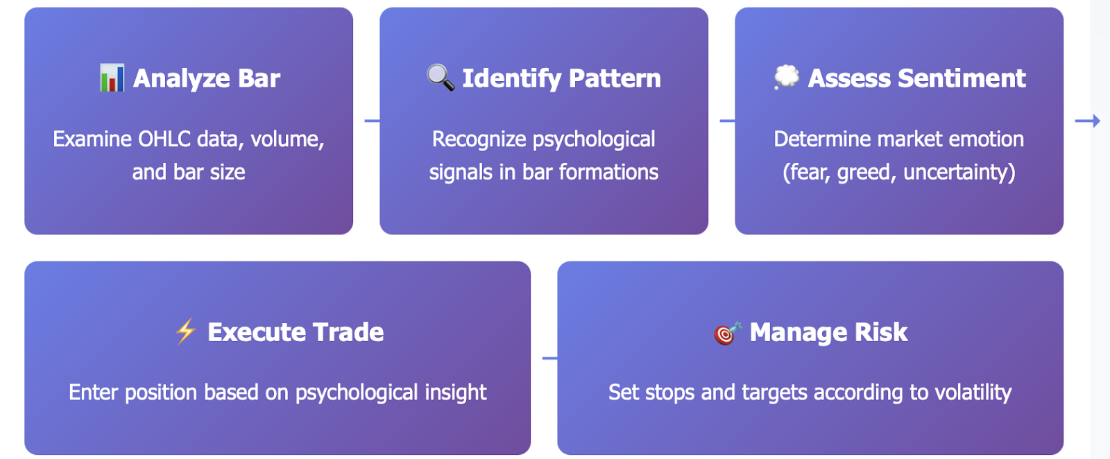
Consider exam score variations displaying class pressure alterations. High scores instill self-assurance like bullish bars. Low scores instill anxiety like bearish bars. The emotional cycle replays in a manner similar to market psychology sequences.
The bar charts of GBP/USD before large anticipated economic news events display anticipation sequences of varying lengths of time. The narrow ranges indicate a wait, while explosive bars afterward reveal shock waves of emotional responses. Professional traders will set themselves up to take advantage of anticipated psychological events.
Market cycles reflect emotional behavior in human beings represented in the sequential bars of price action. Accumulation phases produce small narrow bars. Markup phases display large bars that go higher. Distribution phases produce mixed patterns of lots of volatility. Markdown phases produce lots of downward direction with typically narrow range bars.
Understanding how to use market psychology via a bar chart gives you a massive edge when you trade. You can use contrarian styles of trading when emotions hit extremes, while also being able to use a longer-term trend-following approach when emotional phases continue to develop consistently and extend long enough in duration. Bar chart psychology can help better manage your potential timing in moving from one approach to the other.
Real World Case Studies
Case Study 1: EUR/USD Breakout Trade
For two weeks, the EUR/USD pair had established a consolidation pattern that was between the 1.0800 and 1.0900 price levels on the daily bar chart. The bars, during that time, were showing very small narrow ranges that indicated very low volatility. The volumes also decreased during the consolidation process.
A strong upward bar broke through 1.0900 resistance and closed at the high with volume. This usually suggests bullish momentum. The entry was at 1.0905 right after price confirmed the breakout above resistance. My stop-loss was placed at 1.0880 below the low of the breakout bar.
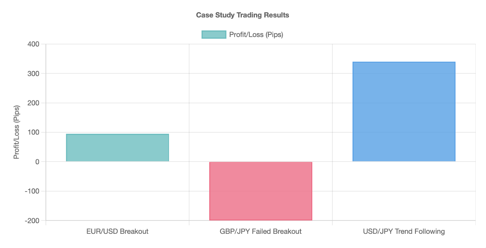
The trade target was set at 1.1000, based on the height of the consolidation range. The price continued upward over the following days, with many bars closing strong at their highs, and my target was hit within one week for 95 pips.
Case Study 2: GBP/JPY Failed breakout.
The GBP/JPY was approaching resistance of 165.00 on the four-hourly chart. The previous bars were showing signs of increasing buying pressure. Volume had increased significantly as price was approaching this resistance zone. The general setup looked bullish potentially for a breakout trade.
The GBP/JPY made a strong move above 165.00 and closed below that resistance level. This created a false breakout pattern because the range high was not taken out. The volume on the failed breakout bar indicated that there was potential for a reversal. Traders who exhibited smart trading principles would have been able to prevent losing a long trade.
The price then reversed sharply the following session. Multiple successive bearish bars confirmed the failed breakout. Any traders who bought on 165.00 would have lost immediately on the stop-loss trade. A false breakout provided a 200-pip decline over two days.
Case Study 3: USD/JPY Trend Following
USD/JPY made a strong move to the upside on the daily chart. Each bar closed higher than the last. There was positive trend structure due to moving averages. Volume was healthy throughout the trend.
The entry signals occurred in the pullbacks to the 20 period moving average. Bullish bars rejecting the 20 period moving average presented low-risk entry points. We could place our stop-loss below the most recent swing lows. The targets were previous resistance levels.
The trend-following method identified a number of profitable trades. In each pullback in the trend several new buying opportunities were created. We were able additional confirmation from the bar chart analysis to identify when continuation was occurring. The systematic method has generated consistent profits over a three month period.
These case studies show how bar chart analysis can be applied in practice. Trading with bar charts takes patience and discipline. A series of failed trades all delivered valuable learning experience. The combination of patterns from bar chart analysis and sound risk management has led to longer-term profitability.
Key Takeaways
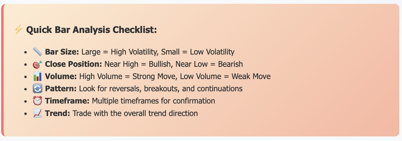
Bar charts show price information in four elements: open, high, low and close. These reproduce the behavior of the market across various timeframes. Understanding the anatomy of a bar chart is the first step to technical analysis.
Timeframes determine trading strategies and decision making. Short timeframes are best suited for day trading and scalping. Long-term timeframes are better suited for swing trading and position trading. An analysis of multiple-timeframes will improve timing and accuracy of entry.
Technical indicators add value to bar chart information. Moving averages can help identify trends. Oscillators like RSI can indicate the level of momentum. Incorporating these indicators will confirm a trading signal and mitigate false break-outs.
Market psychology can be identified from formations of a bar chart. Extreme emotions can create identifiable patterns. Volume indicates intensity of emotions. Identifying psychological patterns can provide trading opportunities.
Advanced elements of bar charts and technical analysis include algorithmic trading and high-frequency trading systems. Bar charts can serve as datum points for algorithmic trading systems, where speed and accuracy become important. Technology is advancing the use of bar charts.
Common pitfalls include over-analyzing charts and under-managing risk management. New traders should hold off on patterns until they are familiarised with basic patterns and indicators. Advanced traders must adapt to changing market conditions. Ongoing education will only help advance performance with bar charts and technical analysis.
Successful trading involves using bar chart analysis in conjunction with implementation of sound money management. To be successful, no single method will work in every market. Your willingness to be flexible and change is what will keep you successful over the long haul. With practice you will gain experience and the ability to read a bar chart.
Ready to Become Master at Forex Trading?
Start today by getting access to professional-grade tools and expert assistance at TradeWill.com! At TradeWill you will have access to real-time bar charts, advanced indicators and educational resources. Create your very own demonstration account today and begin practicing with a risk-free trading strategy.
Join the thousands of successful traders who depend on TradeWill Forex trading and start taking control of your trading experience! Access to our trading platform, market analysis and 24/7 customer service is only minutes away, click below to get started right away or log into your existing account.
[Open Your Free Demo Account Now →]
Disclaimer: The content of the blog does not represent any position of Trade W, does not serve as any trading-related decision advice, and does not endorse any third-party.