

 Trade W
Introduction
If you've opened a forex chart before you most likely seen those rectangular shapes with thin lines protruding from the top and bottom. Those aren't just random squiggles, they are candlestick patterns and they will soon become your best friend in trading.
Candlestick charts do not simply show you prices moving up and down, they tell the story behind every price movement by indicating what buyers and sellers were thinking each time. Basically, candlestick charts are the pulse of the market. Each candle tells you if the traders are confident, scared, indecisive or ready to rock and roll.
For the person who is totally new and simply trying to see if EUR/USD is heading up or down, or even the professional trader who is looking for the best possible entry and exits, candlestick patterns work for everyone. A high school student using a candlestick chart can determine the direction of the market right from the difference between the green candles and the red candles. And a professional intraday trader can use the same formation to determine the most important precise support & resistance levels that could be worth millions in trades.
Here is what makes candlestick analysis effective: it combines hard price data with the human element of market psychology. When you have a hammer pattern after a downtrend, you are visually seeing not just a price reversal, but you are seeing sellers giving up control and the buyers are coming back into the market. When you have three white soldiers climbing your charts, you are watching the effect of sustained buying pressure that all of the major institutions are watching as well.
The greatest thing about candlesticks is that you are not required to buy expensive software or even calculate complex formulas. All trading platforms will be able to show you candlestick charts. Once you figure out how to read them and understand them, you will wonder how you even traded without them!
Basic Candlestick Concepts
Every candlestick contains four pieces of useful information -- the open price, close price, high price and low price for the time period. These four numbers are what create the candlestick shape that you visually see in the charts.
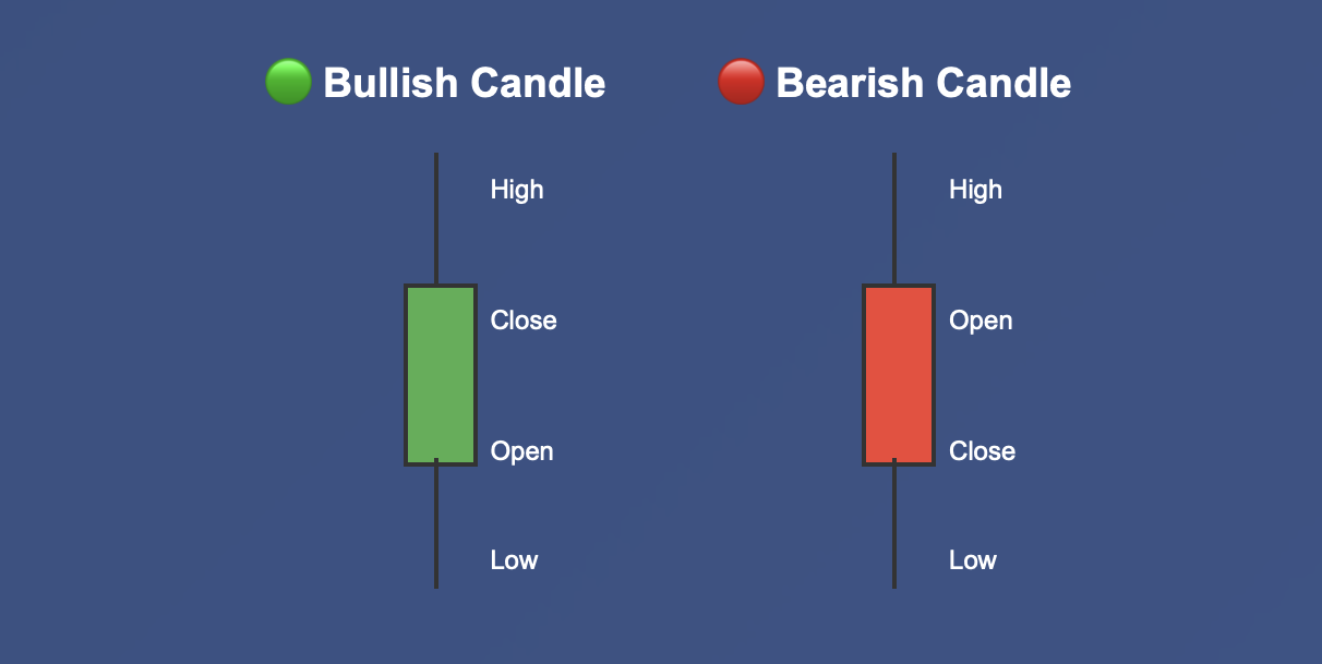
The thick rectangular part (the body of the candlestick) represents the range between the open and close price. If the close price was greater than the open price you would have received a bullish candle, represented in the chart with a green or white color. If prices closed lower than they opened, that would be a bearish candle, represented in the chart typically as a red or black color.
Those thin little lines coming off the body? Those are shadows or wicks that show how far the prices moved away from the opening and closing levels. If there is a long upper shadow that means prices tried to go high but couldn't hold those levels. If there is a long lower shadow, it means that sellers pushed the prices down, but buyers rested back.
You may not see the connection, but visualizing this is kind of like walking up the stairs versus a grassy hill. The bullish candles with small upper shadows and long lower shadows look like someone tried to trip you while you went up the stairs and you stumbled, but regained your footing as you got up. The bearish candles with long upper shadows make it look like you have tried to climb higher, but instead you just slid back down the stairs.
The lengths of the body and shadows tell you everything about sentiment in the market. The deal is with a long body you see strong conviction in whatever direction. With a tiny body you see indecision. With long shadows you know that there is volatility and potentially a reversal. And with short shadows you can tell that there is a steady uniform controlled movement happening.
Understanding the basics will get you in touch with the market's feelings and emotions. A red candle with a big lower shadow after a downtrend doesn't just indicate that prices fell, it shows that sellers are running out of juice and buyers are starting to step in. You wouldn't be able to glean all of that information just from a simple line chart.
Single Candlestick Patterns
Some of the more dependable trading signals arise from single candles with unique shapes. These single candle patterns are like market headlines that indicate very important sentiment changes.
The Hammer
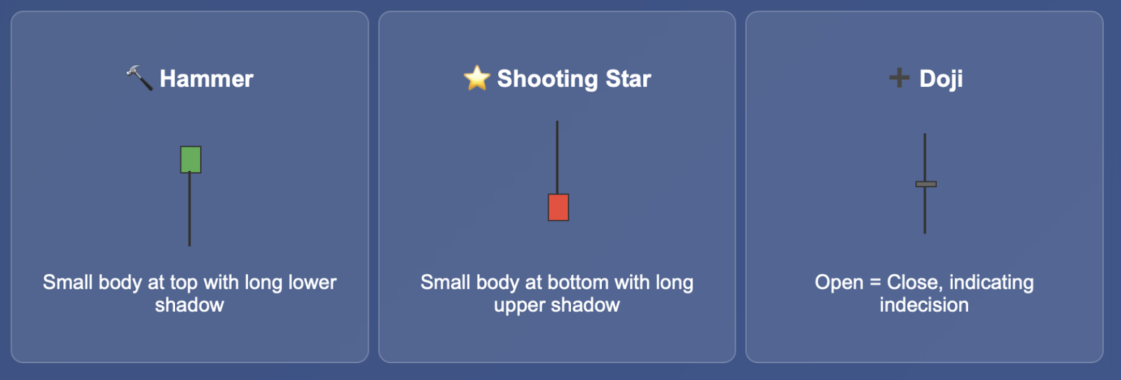
Imagine a mallet lying on its side; that's basically what you are looking for. You will find a hammer at the end of downtrends. It is essentially the market saying, "enough is enough."
The candle has a small body, that will either be red or green, sitting at the top of the range, while the lower shadow must be at least two times the size of the body.
So what did we just see in that candle? Sellers were making their moves, selling down and working it pretty well until buyers showed up, basically saying "not so fast," as they bought up the selling and took price back up to the open of the candle.
It doesn't really matter in terms of the hammer whether it's green or red; the meaning is the same. A lower shadow going longer indicates a better signal of the reversal.
In institutional environments, pro traders will not just jump on any hammer to long. They will want to see a hammer form at a key level of support or after a strong downtrend. The best hammer formations will often be at round numbers or marks where previous resistance now turns to support.
The Shooting Star
The evil twin of the hammer, the shooting star forms at the top of upside trends. While the hammer has a long lower shadow, the shooting star has a long upper shadow - extension at least, twice the length of the body. The small body is close to the low of the candle.
In this situation, it's the hammer story in reverse: buyers drove prices much higher within the period, sellers came in and knocked prices back down. The uptrend momentum might be winding down, and a reversal might be in the works.
The Doji
A doji is a type of candle that is near-identical for the opening and closing price. It looks like a cross or plus sign. A doji represents perfect indecision between buyers and sellers, they were both unable to take control leading to insignificant changes in price, so they both threw in the towel.
Doji's are most significant when they form after a good trend. A candle with someone in control (the buyers in an uptrend or sellers in a downtrend) is starting to lose steam. A doji is a break for the market to decide what direction it wants to move in.
The main part of single-candle patterns is the context, for example the bottom of a three-month downtrend is a better signal than a hammer appearing at random in a sideways market.
Multi-Candlestick Patterns
While single-candles are useful, multi-candle patterns tell a more complete story about a market's behavior and psychology. These normally take two to three candles to form, you can usually expect signals that are better than their single-candle counterparts.
Engulfing Patterns
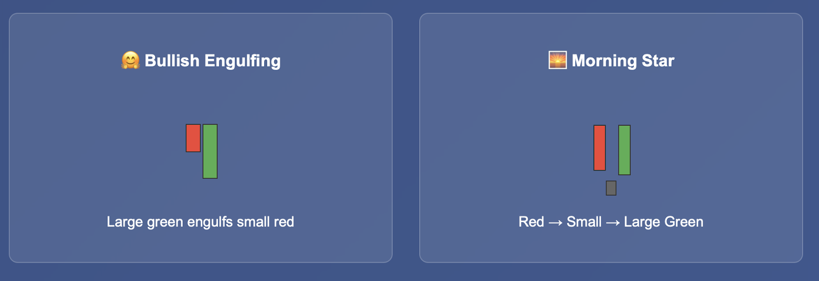
These are some of the most potent reversal patterns you can see. A bullish engulfing pattern is where a small red candle is completely "engulfed" by a green candle the next day. The body of the second candle completely covers the body of the first candle, indicating it was the buyers that overwhelmed the selling force with some serious thrust.
Bearish engulfing works the opposite way - a large red candle completely engulfs a small green candle, indicating that the selling force has taken complete control. The psychology evident in both of these reversals is the same: the previous trend was completely crushed by an opposing force.
Harami Patterns
The Japanese word "harami" means pregnant, and these patterns look like someone just got pregnant. After a large candle (the "mother"), you have a smaller candle (the "baby") that is housed entirely within the previous candle's body.
The harami pattern indicates that the previous trend is losing momentum. If you see a small green candle sitting inside a large red candle after a downtrend, the small green candle indicates that the selling pressure is decreasing. If you see a small red candle that is stamped within a large green candle, the small red candle is telling you that the buying frenzy is cooling off.
Morning Star and Evening Star
These three-candle patterns offer one of the highest probabilities of a reversal in candlestick formation. A morning star occurs near the bottom of downtrends, and consists of three candles: a large red candle, followed by a smaller-bodied candle (which is sometimes a doji) and then followed by a large green candle which closes deep into the first candle.
The middle candle represents indecision as price has shown that sellers are exhausted but buyers have not fully committed. The third candle confirms that buyers are in control. It is like watching a movie in which the villian is dominant in the first act, confusion reigns in the second act, and the hero prevails in the third act.
Evening stars work just the same but in reverse and occur at the top of uptrends as a bearish reversal.
Three White Soldiers and Three Black Crows
When you see three green candles in a row with small or nonexistent shadows, with each opening within the previous candle's body and each closing higher, you have three white soldiers. This pattern shows sustained buying pressure and trend continuation.
It is like watching demand develop momentum - if people want the same stock for three days in a row that is real, persistent demand that the institutional traders look for. This idea is all the stronger when the direction occurs after a period of consolidation or is a new direction.
Three black crows will work the exact same way but with three consecutive red candles. This represents persistent selling pressure and even more continued bearish momentum.
The value of multi-candle patterns is their ability to show continued sentiment, not just price spikes. And the more you combine these with support and resistance levels or trend based analysis, the greater their accuracy becomes.
Practical Application and Tactics
Recognizing candlestick patterns is never the ending. Where the magic happens is when you can include those signals with the other technical analysis tools in your deck to develop a complete trading strategy.
Combining with Support and Resistance
The greatest candlestick signals are going to occur at important price levels. A hammer forming at a major support level is pretty much more important than a hammer that appears in the middle of nowhere. A shooting star at a significant resistance level is a great highly probable short.
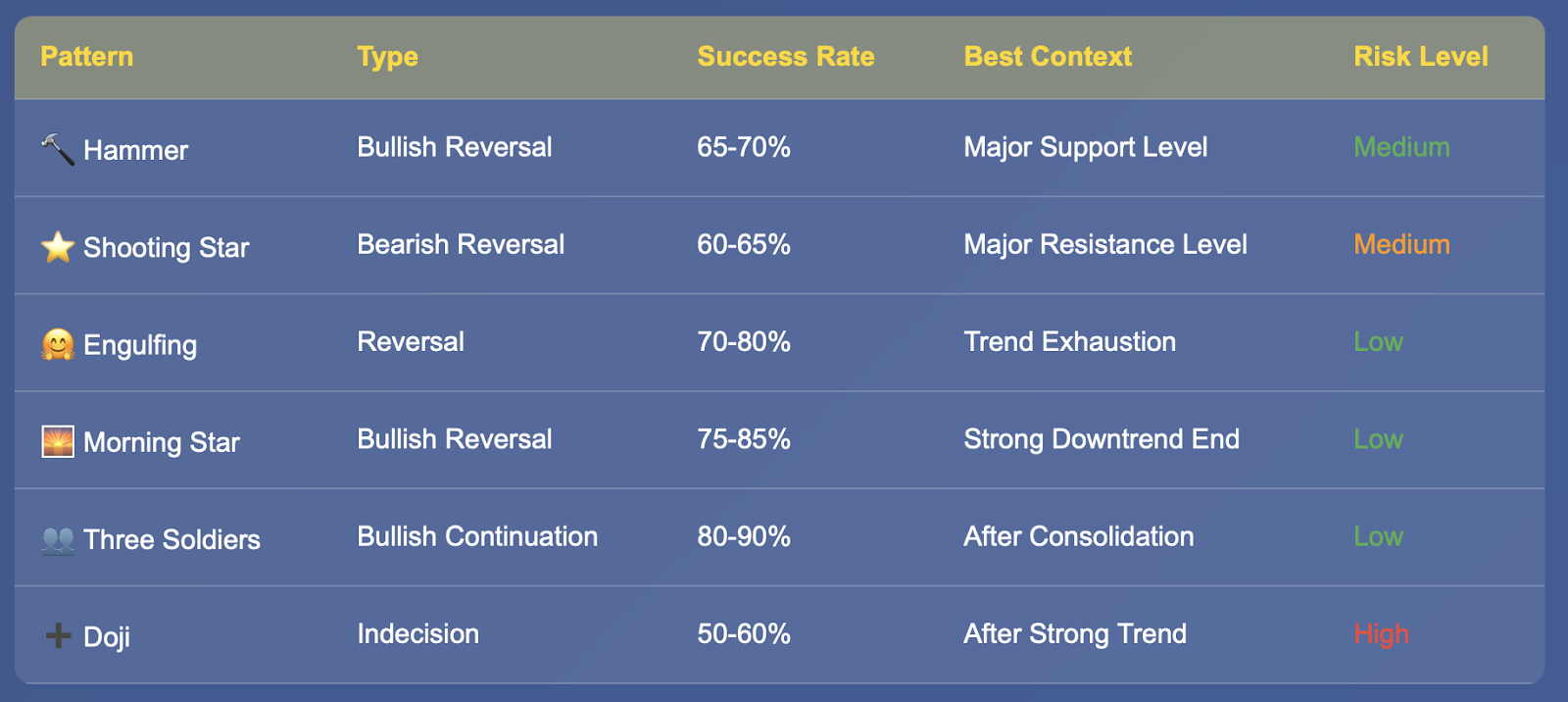
Professional traders will often wait for candlestick confirmations at these major levels. In other words, if EUR/USD has been moving lower and is approaching a major support level, they would watch for a hammer or morning star candlestick pattern to corroborate their thesis of a potential bounce. The technical level, combined with a candlestick confirmation, is a very strong trading opportunity.
Risk Management Fundamentals
When trading candlestick patterns, you must always incorporate some aspect of risk management. For bullish candlestick patterns, put your stop-loss just below the low of the candlestick pattern. For bearish candlestick patterns, you can use stops just above the high of the candlestick pattern. This allows you to have protection if the pattern does not work out for you, while still allowing the trade to play out.
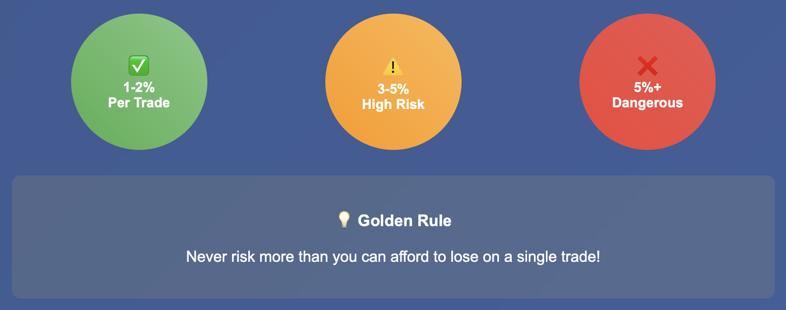
The position size is also important. Even the most reliable candlestick patterns will fail, so make sure to never risk more than 1-2% of your entire account on a single trade. The great thing about candlestick patterns is how frequently they will form. You will consistently have candlestick trading opportunities, so you are not required to risk a significant amount on any one trading setup.
Timeframe Factors
Candlestick patterns can form on any timeframe, although their reliability will vary with the timeframe. Overall, daily and weekly candlestick patterns are likely to be more useful than hourly or minute candlestick patterns. Daily and weekly candlestick patterns are better indicators of long term shifts in sentiment.
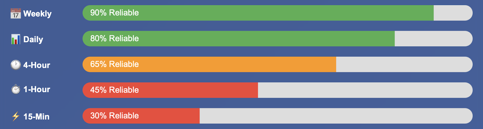
For swing trading, you will be considering only the daily candlestick patterns and the context of the weekly chart. For day traders, you'll be looking for an hourly pattern that is confirmed by daily chart direction. The same goes for scalpers, you'll be using a 15-minute pattern, but you should always check for a confirmation in higher timeframes to confirm that you are trading with the flow of trend.
Confirmation Methods
The best traders are not looking at candlestick patterns in isolation. They waiting for confirmation via volume or momentum indicators or some type of price action. A bullish engulfing pattern that is formed is much more credible if it is accompanied by above-average volume than if it is formed on light trading volume.
Technical indicators such as RSI or MACD can also offer excellent confirmation. If you see a hammer pattern that also coincides with RSI being in an oversold condition then you have several signals confirming the same direction. A shooting star pattern combined with an RSI in an overbought condition would also provide a high confidence short setup.
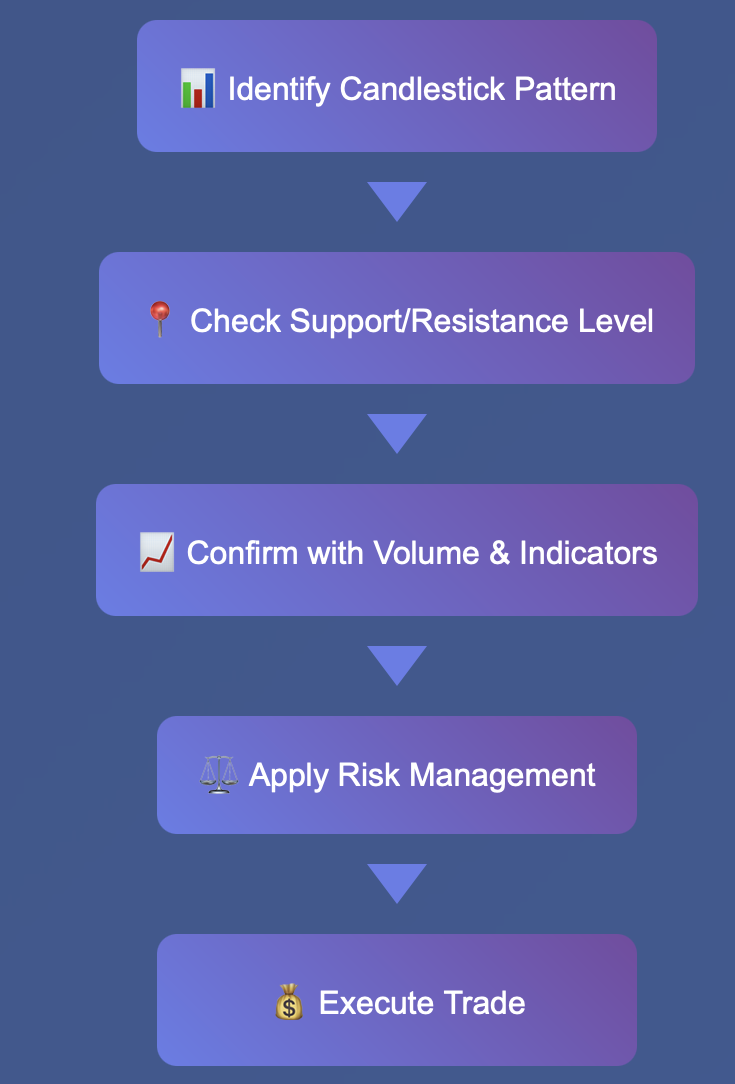
If you are new to trading, you can use this method, recognize the candlestick pattern, determine if it is at support or resistance, confirm with volume, and if all three were in alignment you have identified a quality trade setup.
It's important to keep in mind that fake outs happen. The markets aren't always going to respect technical patterns, which is why you can't forget about confirmation and risk management. The goal is not to be correct all the time. The goal is to be correct more times than you are incorrect and to manage your losses when the patterns don't play out.
Common Mistakes and Tips
Even professional traders get things wrong when interpreting candlestick patterns. Understanding how to prevent these mistakes will have a dramatic impact on your trading success.
The most significant error novice traders make is treating every candlestick pattern as a trade signal. While it is important to study the basic patterns, understanding the situation or context is much more important than the candlestick pattern itself. A hammer in the middle of a strong uptrend won't carry the same weight as a hammer lower than the last handful of candles, after a strong downtrend, at a key level of support. Always think bigger picture before acting upon a pattern.
Low liquidity markets can create misleading candlestick patterns. When trader's are on holiday, trading during early morning hours, or in thinly traded currency pairs, oftentimes orders get so large that they create patterns that do not reflect market sentiment. Trade in major currency pairs during normal trading hours to the extent possible.
Another mistake that is easily made is not acknowledging trend direction. Bullish patterns work the best in uptrends or the conclusion of downtrends. Bearish patterns will work the best in downtrends and the conclusion of uptrends. Trying to fight the primary trend based on a single candlestick pattern is a reliable losing strategy.
Professional traders know better than to rely solely on technical signals without considering fundamental analysis. They will incorporate candlestick analysis with fundamental analysis. If a perfect morning star is completed, however significant economic news is getting released, they will hold off entering a trade until the news has played out.
You are not going to chase patterns that have made large moves by this point. If you discovered a three white soldiers pattern and prices have already run up 200 pips, you have missed your entry point. Wait for the next pattern to play out instead of jumping in late.
Volume confirmation is what separates weak patterns from strong patterns. A bullish engulfing pattern occurred on heavy volume indicates real buying interest. A bullish engulfing pattern completed on light volume was just random price movement followed by no follow-through.
Here’s a big tip: keep a trading journal where you note which patterns work best with your style and in the market. You may notice that some patterns worked best in different periods or with specific currency pairs. This information is very useful in refining your trading methodology over time.
Conclusion
Candlestick patterns are one of the most useful skills any forex trader can learn. They provide more information about market psychology than anything simple line charts can do; they show the battle between buyers and sellers at every price level.
The patterns we looked at today - both single candles like hammers and dojis, and multiple candles like morning stars and three white soldiers, are corner stones in technical analysis. But remember, candlestick patterns work best with trend analysis, support and resistance levels and have appropriate risk management.
Don’t expect to become an expert in reading candlestick patterns overnight. It is just like any other skill and you need to practice and get experience. To start, open a demo account and practice identifying candlestick patterns in ‘real time’. Follow how they develop, and what happens as they unfold to see if price action goes as you would expect. Eventually you’ll start to get a feel for the setups that offer the best risk-reward ratio.
Successful traders realize that candlestick patterns are not magical cures, but they are probabilistic tools. When used properly, candlestick patterns work more than they don't, and when added to your trading toolbox along with sound money management and a disciplined approach, candlesticks will give you an advantage when forex trading.
Keep practicing, keep waiting, and remember expert traders once all started exactly where you are. The patterns that seem confusing to you today will not feel confusing once you have developed your experience. Start your future trading in the forex markets with tradewill.com today!
Disclaimer: The content of the blog does not represent any position of Trade W, does not serve as any trading-related decision advice, and does not endorse any third-party.