

 Trade W

The hammer candlestick pattern is an important pattern that can signal the upside reversal of a security's price when you see a sharp drop followed by a huge spike. This hammer candlestick has been used by traders to identify reversal points for a very long time, but many traders are using it incorrectly.
What Is a Hammer Candlestick Pattern?
A Hammer candlestick is shaped like a hammer, which is how it gets its name. The Hammer candlestick has three distinctive features that make it easy to recognise on any price chart:
-
The body of the Hammer candlestick is very small and located at the very top of the candlestick.
-
This body shows the difference between where the price opened and closed.
-
The Hammer candlestick has a long lower shadow that reaches down below the body and is typically at least two to three times longer than the body itself.
The body has little or no upper shadow located above it.
The true power of the Hammer candlestick pattern lies in what the shape of the candlestick reveals about market psychology. A Hammer candlestick appearing at the bottom of a downtrend pattern shows that sellers pushed prices substantially lower through the session; however, buyers returned to the market and pushed the prices back up towards where they opened. This can indicate a potential price reversal.
There are two types of Hammer candlesticks based on the colour of the candle: Green (or White) Hammer candlestick, which indicates that the close was at a higher price than the open, and is usually more bullish to traders, and Red (or Black) Hammer candlestick, which shows that the close was below the open, however, this type of Hammer can still indicate a possible price reversal. The Hammer candlestick pattern is the same for all markets. The same is true whether you're trading Stocks on the New York Stock Exchange (NYSE), Currency pairs, such as the EUR/USD on Forex platforms, Gold on the CME, or CFDs. In all cases, the price has been rejected at lower levels. Buyers have supported the price level, and momentum has shifted.
However, one thing to keep in mind is that the Hammer candlestick pattern alone does not provide sufficient evidence of price reversal. Ideally, for any candlestick pattern, confirmation should be sought from the following candle in conjunction with increased volume.
A Hammer candlestick pattern without these features is just a guess, and it is most effective when it occurs at established support areas or after lengthy periods of falling prices and with buyers exhibiting signs of being exhausted.
How to Spot a Hammer Candlestick on Your Charts
To properly identify a hammer candle, we need to look beyond just the long lower shadow of the candle. It takes time and practice to find the right hammers. The best way to become familiar with hammers is to identify their specific characteristics in the market. Once you understand how to identify hammers in the market, you will be able to identify the correct ones much more easily. Here’s what to look for when identifying hammers.
The small body of the candle should be located at the top of the candle range. If the body of the candle is greater than one-third of the overall height of the candle, then the candle is not a hammer candle. The lower shadow of a hammer candle should be at least twice as long as the body of the hammer candle, and ideally, the ratio of lower shadow to hammer body should be three to one or greater. A strong hammer candle typically has a lower shadow that is four to five times as long as the body of the hammer candle.
In addition to a long lower shadow, there should be very little or no upper shadow associated with a hammer candle. An upper shadow of a few ticks would be acceptable, but if there is significant trading above the body of the hammer, then the hammer is not valid; rather, the hammer is part of another candlestick pattern.
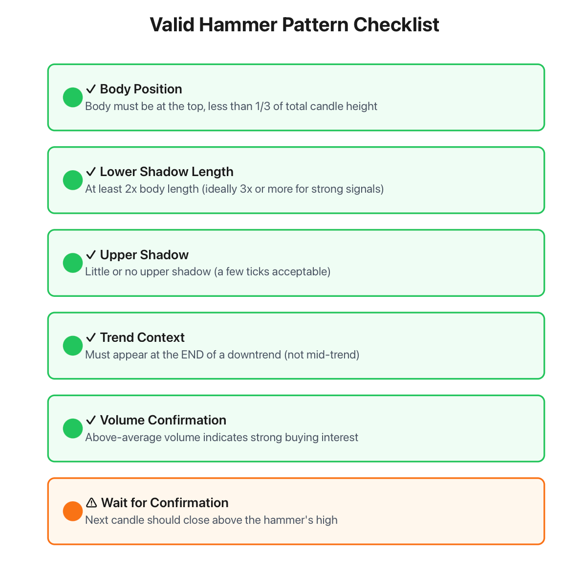
The shape of a hammer is important, but the location where it occurs is even more important. A hammer candle can be classified as a hammer pattern if it forms at the end of a bearish market trend, but if it occurs anywhere else, such as at the mid-point of a bullish market trend, then the hammer candle pattern will be referred to as a Hanging Man pattern.
The last confirmation of the hammer pattern will come from the volume associated with the hammer candle. When the hammer candle occurs at the same time as the hammer formation, and volume is above average volume, this indicates that buying activity is present at the lower end of the price range. Hammer candles with volumes below the average will indicate a weaker reversal because fewer traders participated in this market action.
Let’s take an example of a trader watching a gold CFD on a daily chart. The price has dropped for eight consecutive days from $2,100 per ounce to $2,040. On day 9, the price opened at $2,038, but dropped all the way to $2,020. After trading back into the range, the price closed at $2,036 and created a small red candle with a long lower shadow. This candle is now identified as a hammer candle.
Traders tend to become overly excited and impatient while searching for hammers. These traders will look for any candle that looks like a hammer. They frequently ignore small details about how and why a candle is classified as a hammer. In many cases, traders who view the ratio of the hammer's lower shadow to the hammer body will see that the ratio is only 1.5:1 or that the hammer has a significant upper shadow, indicating there is resistance above. Understanding these distinctions is critical to properly interpreting the current price trends of the market.
A hammer can be thought of as a form of trampoline. When buyers jump upward toward a mat, they exert energy downward against the mat, creating downward force. It is the downward force provided by the lower shadow of a hammer candle, combined with the upward close to the end of the day, that demonstrates this effect. If there is little upward movement in comparison to the closing price, then this implies that there is not sufficient strength in the market to completely reverse.
Another important point regarding hammers is to pay attention to multiple hammer patterns. When more than 2-3 hammer patterns occur at the same level, this is additional verification that price support is present at that level.
The Market Psychology Behind Every Hammer
When you're able to understand how hammers function in the marketplace, that will give you confidence when trading this pattern. It's not random; it mirrors true changes in market sentiment.
At the time of the lowest point of a downtrend, sellers are still dominating the price action; they're willing to take less and less for their product, while buyers have no interest in stepping in because of their fear that prices are going to continue to decrease. Eventually, as prices decrease, there come points where buyers who are oriented towards value become interested in buying. Perhaps the price has reached a technical support area or might make fundamental sense, or perhaps the price is too low; therefore, the sellers' loss creates an oversold condition, and buyers have set up automatic buy orders at that level and for the same reasons above.
The point at which buying momentum meets selling momentum creates a hammer with a long lower shadow. The sellers are still in control of the price actions early in the session, until at some stage later, buyers are showing up in the market in great volume, completely stopping the decline and pushing the closing price back close to the original opening price.
Similar to upside-down triangles, the importance of the price's closing level is also very important to you as a trader, as the closing level indicates where in the range the buyers were able to stop sellers from pushing the price lower and were able to maintain that level.
For example, USD/JPY has had a sustained decrease from 150.00 to 146.50 over a period of 2 weeks. Now one day, it has opened at 146.45, then traded down to 145.80 while the London market was open, and traded back up before the close to 146.40. The 65 pip long lower shadow versus the tiny 5 pip long body tells you that the sellers attempted to push the price lower; however, it was unsuccessful, and it was something of a farce.
To further illustrate this, beginners can think of it as a skipping rope on the side of the playground. When the rope is thrown onto the ground, not only does it stop, but it bounces back up into the air. The longer the shadow, the more momentum that has built up and therefore, the greater the potential for a reverse.
Volume also adds to this depth of understanding of the price action. When there is significant volume during a hammer formation, it suggests that there are many more participants involved in the reversal process. Additionally, a large number of buyers entering the market signifies a stronger conviction by a larger group of traders.
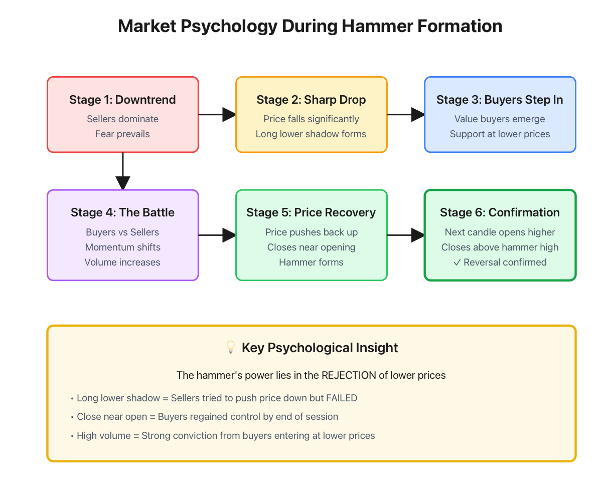
The best hammers are those that are developed at the lowest levels of bearish market sentiment, so when the market is nearing its lowest point and everybody is anticipating another round of sell-offs, and a hammer appears, it is often a surprise to those traders, and therefore, there could be a stronger rally as short sellers scramble to cover and sidelined buyers run in.
Trading Strategies: How to Actually Make Money with Hammers
Identifying hammer candlestick patterns is easy; however, trading these patterns. When using hammers, it helps to combine your hammer with other technical indicators for greater odds of success. Look for hammers that appear near major support zones, swing low pivots and Fibonacci retracement levels. If a hammer appears near the 50% or 61.8% level of a prior venture, this creates a high probability opportunity.
To add even more confidence to your hammering trades, assess the moving averages as well. If the hammer forms at or near the 200-day moving average, then you can have two layers of validation: the hammer as a reversal signal, and the moving average providing a strong bullish support level. The best trades tend to have multiple confirmations before entering.
You can leverage additional signals as well by utilising technical indicators, such as the MACD and RSI. For example, a hammer pattern occurs on a daily EUR/USD chart with an RSI reading of less than 30 (currently oversold) and MACD bullish divergence. There are multiple signals indicating that a reversal is likely.
Here is an example using Bitcoin CFD, which fell from $48,000 to $42,000 with a hammer forming on the daily chart at $42,100, with a low of $41,200 and a high of $42,300. RSI indicated oversold conditions at 28, and the 200-day moving average is at $42,000. The opening of the next candle occurred at $42,200, which traded to $42,500, breaching the hammer's high.
The entry for this trade could take place at $42,301 (just above the hammer's high), placing a stop loss at $41,150 (below the hammer's low with a cushion), which would mean a risk of $1,151. The reward target would be $44,603, thereby providing a 1:2 risk-to-reward ratio trade setup.

One advanced technique to employ would be to scale into your positions, meaning that rather than putting on 100% of your position size as soon as the hammer high is broken by the confirmation candle, put on 50% of what you'd like to trade. Wait to add the other 50% until the price breaks above another resistance level. This way, you'll reduce your risk if your anticipated reversal fails early.
The trampoline analogy works well in this context: Just like you would wait to see if the trampoline would support your weight before jumping on it, you'll wait for a confirmation of the first candle before jumping in. Now, you already know that the trampoline can support your weight (the confirmation candle).
Avoiding the Most Common Hammer Trading Mistakes
Nothing makes a seasoned trader feel like a fool more than making a classic rookie mistake when trading hammers, so I'll share with you the single biggest mistake you could make when trading hammers.
The number one mistake is failing to take into account the context of the trend. Hammers are only useful for projecting an upside reversal if they form along the lowest point of a downtrend. If you notice a hammer candle and there was no downward movement before it, that hammer is not going to tell you that there will be an upside-down reversal. You need to make sure that there is clear declining price action leading into the hammer formation.
Most traders are making another common mistake by completely ignoring volume as part of their analysis. A hammer that is formed without sufficient volume can mean that there is not enough confidence in that hammer. That hammer may just be a temporary pause in the ongoing downtrend. Volume indicates there is actually money coming into the market at lower prices. If the price is rising on volume and there is no evidence to support it, then you are trading based on the hope that the price will continue to rise.
One of the more costly mistakes traders make is jumping into a trade before all the signs indicate it is time to buy. I see this happen far too often. A trader sees the hammer candle and immediately buys before they have confirmation of what the next candle will do. The next day, the price opens and continues to decline, meaning that the hammer did not signal a buy, and now the trader has a losing position.
Live and die by hammers as a stand-alone indicator; it is a problem that a lot of traders experience. To make the most out of technical analysis, you need a combination of several indicators. If a hammer forms randomly in time, then that hammer has no reason to exist in the first place. But if the hammer forms on a strong support level in conjunction with a high RSI that is declining and a bullish divergence from MACD, then you have an excellent opportunity to put on a trade.
Because of the problems above, we'll demonstrate what happens when these mistakes are made in a real trade example. Let's take a look at a daily GBP/USD chart. Recently, a trader saw that a hammer formed at 1.2450 after the price dropped from 1.2650. The trader saw the hammer and jumped into the trade immediately without waiting for confirmation. The next candle opened below 1.2430 and continued downward to 1.2380. The hammer signal was then completely invalidated because it was in the context of an already strong downtrend, and there was no confirmation.
Risk management failures make the above mistakes even worse. Many traders risk too much of their total capital on any one hammer trade. Even if the hammer looks perfect, you should risk no more than 1-2% of your total trading capital on any one trade, regardless of whether it appears to be perfect. Even with ideal setup parameters, it is still possible that they will not work out.
Think back to the trampoline analogy. When you jump to the top of a trampoline without putting on safety gear, you increase your chances of landing awkwardly and hurting yourself. The same holds for hammers executed without proper risk management. One mistake may mean that you lose several weeks of hard-earned profits if the trader does not have their risk properly managed.
Also, keep in mind the size of the position. Just because you take a position based on a hammer does not mean that you should use your entire position size for the trade. Instead, size the trade based on how good the setup is. If it fits all three criteria of developing volume, the correct trend context and has confirmation, then you would take a larger trade size compared to if it has only two of the criteria.
So what can you do to correct these errors? You should develop a checklist each time you are going to make a hammer trade, which should verify trend, volume, confirmation, support level, stop placement, and compute your position size based on risk. If you do not have all of these items verified, then do not place the trade.
Does the Hammer Pattern Work in Gold, Forex, and CFDs?
The hammer pattern is prevalent across all types of tradable instruments; however, the reliability of the pattern can be impacted by differing market conditions. Understanding these variances can help you adjust your methodology.
The hammers work very well in Forex pairs (such as EUR/USD, GBP/USD) on both daily charts and 4-hour charts. The currency pairs should generally be able to follow technical patterns due to the large volume of liquidity and variety of participants. When a hammer forms at a significant support level within the Forex market, it is usually respected because institutional traders are also using the same methodology as you do for their analysis of the market.
In the case of gold and other commodities, you can see a lot of hammer formations, particularly on daily charts. Commodities tend to trend in one direction very strongly and have specific support or resistance areas, which increases the possibility that hammer formations will be like traditional reversal points. If the price of gold is declining, and a hammer is formed at a former support area, many buyers will typically jump in aggressively to purchase gold.
The stock market is more complicated. Individual stocks form hammers, but the reliability of hammers formed by a particular stock may vary widely in comparison to other stocks based on liquidity and the size of the stock (small cap vs. large cap). A large-cap stock trading on the NYSE typically shows more of a clear hammer than the large majority of thinly traded small-cap stocks (individual orders can make the candle shapes distorted).
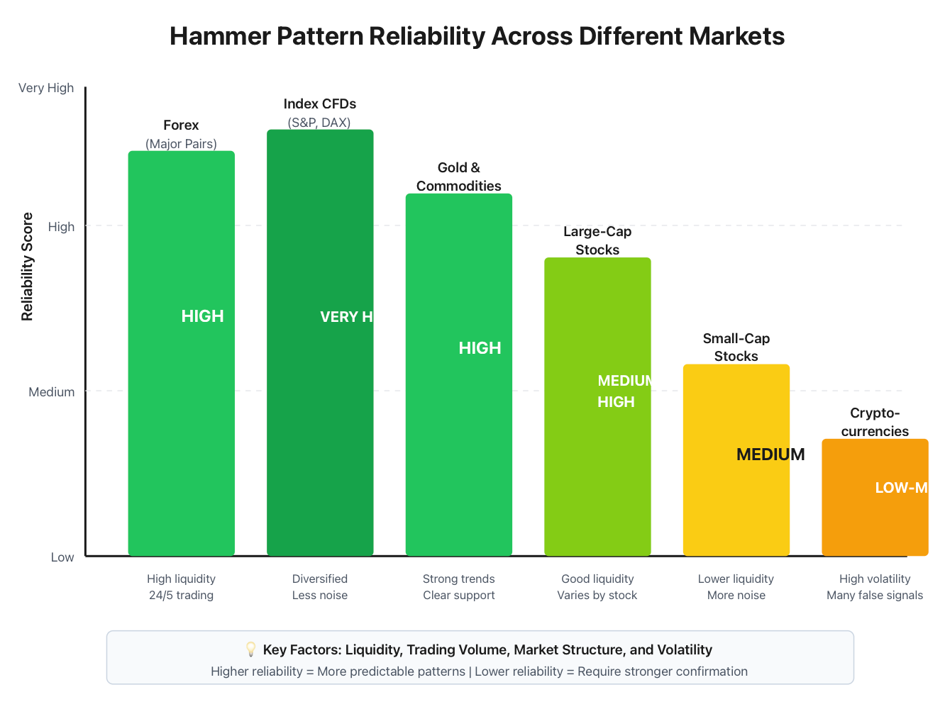
In the case of CFDs on indexes such as the S&P 500 or DAX, excellent hammer signal formations will be created because you are trading a group of individual stocks instead of one individual stock. This provides for a rebalancing of noise and thus, technical formations have a higher reliability. In addition to that, a hammer created on an S&P 500 CFD has much more significance than one created for a random penny stock.
High volatility contributes to the variability of the reliability of hammers. The aggressive volatility of cryptocurrencies results in the creation of more hammer candles than in many other economic sectors, and, therefore, the successful formation of a hammer candle is less likely. As a result, hammer candle formations can occur during periods of normal volatility in the cryptocurrency market (i.e., Bitcoin) and will often occur along with some confirmation, but traders should be aware that in a volatile market, the probability of success of a hammer candle is greatly diminished.
To illustrate this point, take a look at the chart of the EUR/USD currency pair. After falling from 1.1000 to 1.0850, a hammer candle was created on the daily chart at the 50-day moving average with above-average volume, and the next day the open was confirmed with a close of 1.0890.
Therefore, while this setup is a high probability entry point in a generally stable market, the picture of the same price movement in a volatile environment (i.e., London trading in the gold futures market) demonstrates that while this hammer candle looks like a perfect candle formation, due to intraday volatility the likelihood of it being merely an aberration is much higher than in the case of the EUR/USD example. Therefore, in such a market, traders would require much greater confirmation before acting on this candle pattern, and would expect the pattern to be of less reliability.
The trampoline analogy is also relevant in this context. Different trampolines follow different elasticities, so a trampoline used by a professional gymnast will provide a more helpful bounce than a backyard trampoline. Conversely, reliable trading in liquid and well-traded markets is much more likely to produce reliable bounces off of hammer candle patterns compared to trading in thinly traded or highly volatile markets.
Market structure must also be analysed. Examples of forex markets operate 24 hours a day, meaning that daily closing prices will be different at each brokerage firm, resulting in the creation of inconsistent hammer patterns. Conversely, the CME gold futures market clearly delineates daily sessions, which results in cleaner candle formations.
Another factor to take into consideration when comparing two hammer candle setups is the ongoing strength of the corresponding trend. In a strongly trending market, hammer candle patterns will typically fail at minor pullbacks due to the overwhelming performance of the dominant trend. However, hammers at the conclusion of a lengthy trend will generally have a higher probability of success when other indicators suggest an overall exhaustion of the momentum produced by the overall trend.
To best evaluate which candle patterns are the most reliable hammer candles in your time frames and specific markets, make the effort to keep a trading journal documenting hammer candle setups and all relevant details about their context and outcome over time. By maintaining such a journal, you will better understand which markets and conditions provide the most predictable hammer candles to take action upon, based on your overall trading style.
Hammer vs Hanging Man: Understanding the Critical Difference
The misunderstanding of hammers and hanging men happens to more traders in candlestick analysis than practically any other thing. The difference is location within a trend. A hammer has the potential to reverse upwards at the bottom of a downtrend, while a hanging man has the potential to reverse downwards at the top of an uptrend. While these formations look identical, they are viewed differently due to the surrounding context where they occur.
If you examine closely, you will find that both hammers and hanging men have small bodies, long lower wicks, and small upper wicks. The difference between the two formations does not lie so much in the colour of the body but rather the surrounding context and some traders need to be able to see a green hammer next to a red hanging man to feel confident in the signals these formations give.
Both hammers and hanging men also have an inverted psychology. Hammers indicate a buying force is defending the lower prices after a decline, and therefore, there is an exhaustion of selling pressure. Hanging men indicate that although the market is in an uptrend, prices dropped dramatically during the trading session to recover before close; therefore, this downward jump indicates the buying force is losing control.
The volume requirement for confirmation also differs. A hammer's volume confirmation works best with increasing volumes, while a hanging man's volume confirmation works best with decreasing volumes, even though prices recovered at the end of the trading session.
To illustrate, let's say, for example, that the S&P 500 has increased from 4200 to 4580 over the last few weeks; once the index reaches 4580, it has completed a hanging-man candle, indicating that the uptrend might come to a stop. If we check the following day's candle closes below the hanging man's body, this confirms our suspicions about the continuation of the uptrend.
Conversely, if we were to see identical candles located between 4580 and 4350, then this candle formation would represent a hammer and indicate that the downward momentum from 4580 to 4350 would have been exhausted, and prices are likely to bounce back toward 4580 again before checking the next candle to see if it closes above the hammer high.
To assist with this understanding and remembering the differences between hammers and hanging men, use the trampoline analogy when looking at the location and formation of each candle. Picture the way you bounce when jumping from the top of the trampoline compared to the way you bounce off the bottom of the trampoline. While you would be losing all of your upward momentum at the top, at the bottom, you would be gaining downward momentum from the spring of your jump.
Many traders tend to overlook this important difference due to the quick scans of the charts and think that all of the distinctive-shaped candles are bullish without checking the trend context before making a trade. Therefore, many traders will enter long trades on hanging men or short trades on hammers.
Be sure to ask yourself the following questions each time you are examining hammers and hanging men: What has been the direction of the market's previous movement? Is this candle appearing after a long, sustained trend? How is the volume for this candle behaving? What will the next candle do?
These questions will help prevent you from costly mistakes that result from confusing hammers and hanging men.
One tip to save time the next time you see either a hammer or a hanging man pattern is to immediately zoom out the chart to get a better perspective. If the overall trend of the market is going up, then it is likely a hanging man. Conversely, if the overall trend is going down, then it is likely a hammer. The most important aspect of both candle formations is their location within the overall trend.
Final Thoughts: Making Hammer Patterns Work for Your Trading
A hammer candlestick pattern is one of the most recognised and trusted reversal patterns in the world of technical analysis; however, the context in which it is used to determine a potential reversal is incredibly important when trying to identify the potential for reversals.
One of the first things to consider when using this candlestick pattern is the area where it appears. For example, you want to ensure that it is found at the bottom of a downtrend where the selling pressure has diminished.
The hammer candlestick pattern needs to have a long lower shadow that is at least 2x the length of the body of the candle. This long lower shadow indicates that there was strong buying interest and that traders are now willing to buy at a higher price than the open price of the hammer.
In addition to the long lower shadow, you will also look for heavy volume beyond the average volume, indicating that the buying interest is genuine. To confirm the reversal, the next candle after the hammer candlestick pattern must have a closing price above the high of the previous hammer.
Combining the hammer candlestick with other technical indicators is suggested to achieve higher probabilities of success. This will include looking for hammer candlesticks at support levels or moving averages/Fibonacci retracement levels; also, checking indicators such as RSI and MACD for bearish divergence and that the hammer is forming during an oversold condition, which adds to the probability of a successful trade.
There are several common mistakes that new traders make when trading with the hammer candlestick pattern. Do not ignore the trend context; always wait for confirmation before taking an entry; volume analysis must always be included in the process and place proper stop-loss orders, and do not risk too much on one trade.
Different markets have yielded different results when it comes to hammer patterns so it is recommended to take the time to practice in the markets you primarily trade and in your preferred timeframes and keep accurate records of the trades you made (what's worked and what hasn't) and be adaptable with your approach to hammer candlesticks by accounting for the volatility and the market structure.
Becoming familiar with the hammer candlestick pattern will require practice; therefore, before putting real money on the table, start by finding hammer candlesticks on historical charts and reviewing the hammer candlestick patterns that were a success versus the ones that were not. Take time to find the similarities in those successful trades; develop your pattern recognition skills until identifying quality hammers is second nature.
Now you are ready to begin implementing the hammer candlestick pattern into your trading plan. To start with a strong foundation and understanding of how to apply these patterns in different market conditions, test the hammer candlestick pattern in your preferred markets and timeframes, log your progress and hone your strategy as you become a more proficient trader in reversal candlestick patterns; go to tradewill.com and learn how to improve your trading by using these techniques and tools on your historical data.
Disclaimer: The content of the blog does not represent any position of Trade W, does not serve as any trading-related decision advice, and does not endorse any third-party.