
 Trade W
Most indicators of market direction can tell you which direction the price is going. The Market Facilitation Index (MFI), however, gives you much more than that: it tells you how effectively the price is travelling.
The Market Facilitation Index was created by Bill Williams, a trader and psychologist, and has a fundamentally different way of interpreting reality for a lot of traders. The MFI measures the number of price movements per unit of volume. If you’ve ever pushed open a heavy door, you’ll understand that there are times when you can push on it really hard and it won’t move much, while there are times when a light push will cause it to swing all the way open. The MFI will show you whether the door is easy or hard to open.
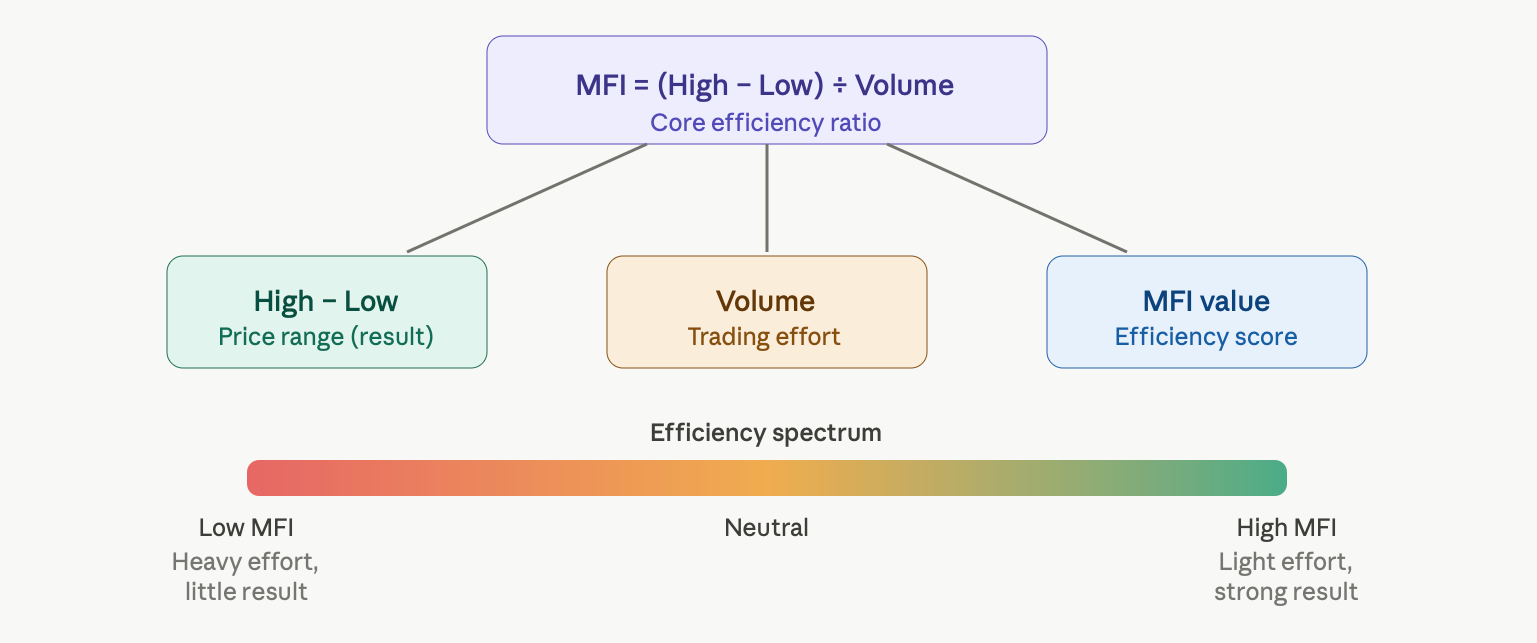
The MFI is calculated by taking the ratio of the range between the high and low of a candle divided by the volume, as shown in the following formula. The higher the number of the MFI, the more efficiently the market is moving, as it is covering a large amount of ground with very little volume. A low MFI shows that the market is grinding, expending a great deal of volume but accomplishing very little.
The MFI is used by traders to find hidden strength and weakness before it appears in price. If you see a sharp move on low volume in Bitcoin, most traders are likely convinced it will continue.
People use MFI because low volume can create both momentum and accumulation; both are elements of a trend. The finer point of distinction is the edge.
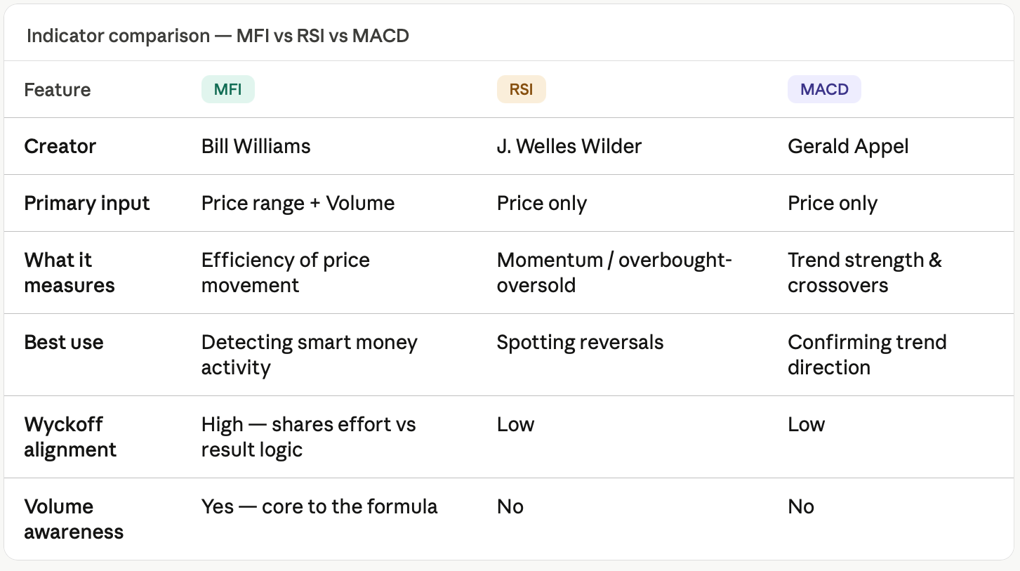
What distinguishes MFI from other indicators is the emphasis placed on volume as opposed to price. RSI measures price momentum through a calculation of oversold/overbought conditions. MACD uses price only for analysis based upon moving average crossovers to determine trend direction/strength. Both require prices only in their respective calculations. In contrast, MFI includes volume in its calculation and therefore creates a completely different measurement of price/volume relationships, which are closer to Richard Wyckoff’s theory than the traditional interpretation of oscillators. Wyckoff showed that between the two of them, price and volume, they reveal the market player’s intent; MFI develops a numeric representation of that combined relationship throughout each and every candle.
MFI Formula Explained: How the Indicator Measures Price Efficiency
To obtain the MFI, you must find the difference between the high and low of a candle, divide by the volume, and then you will have your answer.
MFI = (High – Low) ÷ Volume
There are different meanings attached to each piece of information. The difference between the high and low of the candle indicates how far the price moved in that time period. The volume from that candle illustrates how much effort (by the market) was required to move the price that much. Thus, if you divide the distance the price moved by the volume of the candle, you will get a measure of the efficiency of that price move. If there is a price move that is large but with little volume, this would give a high score for efficiency, whereas if there was a price move that was small but with large volume, this would give a low score for efficiency.
At this point, the Wyckoff Method is related to this concept. Richard Wyckoff studied for many years how large institutions acquire and unload their positions before there is any significant price movement. Wyckoff discovered that volume represents the amount of effort that it takes to get an item to a price, whereas price movement represents the result of that effort. Anytime there is a mismatch between volume and price range (price movement), something significant is happening below the surface. The MFI provides insight into this mismatch automatically for each candle.
If the MFI is high, this means that there has been a significant price move with little volume; in other words, the path of least resistance has been established, and it is reasonable to assume that there are large buyers creating this price move. When the MFI is low, this suggests that there was a large volume with very little price movement. In Wyckoff's terms, this represents absorption, whereby large institutions are either acquiring supply without causing a price movement or unloading their positions without causing a price movement.
If you walk side to side while carrying a light bag, you will be able to cover the room with little effort and will travel from one end of the room to the other. If you do the same thing while carrying a car engine, you will use a tremendous amount of energy but will not move at all. The scenario of carrying the bag has a high MFI, whereas carrying the engine has a low MFI. A situation in the marketplace similar to that of the engine scenario usually signifies a major reversal of prices because there is a significant player attempting to control price with unmanageable amounts of capital.
MFI Color Bars Explained: How to Read Green, Brown, Blue, and Pink Signals Like a Pro
When you overlay volume changes with your MFI changes, it’s the colored bars that you see, the four different colors, that give you the real power of this indicator. Each colored bar provides information about the market’s condition (i.e., whether the market is bullish or bearish). Once you understand what each color means, you will be able to analyze charts fundamentally differently from how you currently do.
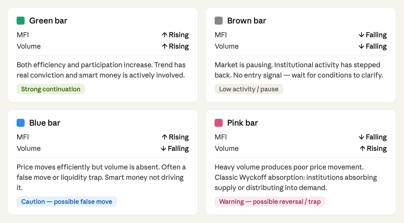
Green bars: Both MFI and volume are going up at the same time, which is the most straightforward signal. In other words, price has moved up significantly, and more participants are participating in that increase. This means that smart money is involved in the move, and the trend has real conviction. If you see multiple green bars during a bullish run on Bitcoin, then there’s a good chance that institutional money is driving the increase. The multiple green bar signals you see during a breakout above resistance are confirmation signals that you want to act upon.
Brown bars: Both MFI and volume are declining at this time. The market is in a resting phase, neither building pressure nor releasing pressure. Institutional money has stepped back, and the market is resting. This does not signal that the market is bearish, but it does mean that you should not add new positions until there is an increase in market activity. You can visualise this as an inactive crowd that has neither exited nor entered.
Blue bars: The blue bars across the top of the chart illustrate an increase in MFI with a decrease in volume. Price is making efficient movements, while the volume has not kept pace with those price movements. This creates a deceptive environment. Breakouts that appear clean with blue bars behind them generally indicate false breakouts that are created to create fear in retail traders, or entice breakout buyers prior to the price reversing.
Intelligent market players won't create volume to prove that they are behind the movement. Thus, any blue bars should be considered with skepticism, regardless of how convinced you may be based on price action.
Pink bars: Pink bars are generated when MFI drops while volume rises.
In volume analysis, one of the most important indicators of any trend is the incredible disparity between volume and price efficiency. This phenomenon was referred to by Richard Wyckoff as "efforts with no results." Large players are either accumulating against sellers or distributing into buyers to absorb price movements.
When Bitcoin creates a spike high accompanied by pink bars, it is generally the last gasp before a significant pullback, with institutions discreetly unloading their positions while retail buyers rush in to purchase.
MFI vs Wyckoff Theory: How Smart Money Reveals Itself Through Volume
Using the Wyckoff Method, Richard Wyckoff studied how the largest market operators, which we now call institutional traders, got into and out of large positions without actually moving price until they were ready. His conclusion was that the market's actions are telling a story through price and volume, and that story is easiest to read at price turning points.
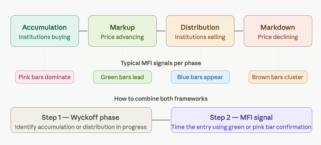
The Wyckoff Method is designed to be utilized on a macro level and identifies that phases in any timeframe consist of four types: accumulation, markup, distribution, and markdown, all having similar characteristics of price and volume. Identifying which of these four phases a market is presently in will provide an investor with greater context for investment opportunities. However, Wyckoff's method does not provide precise timing of entry within the identified phases. This is why MFI is a perfect partner for the Wyckoff Method.
The MFI method provides the micro level for the Wyckoff Method by using the effort versus result principle to provide a quantifiable indicator on every single candle. Therefore, when MFI signal bars are placed on the Wyckoff accumulation phase, the pink signal bars tend to stack up at the bottom of the accumulation price range, demonstrating that institutional traders have absorbed the selling pressure. As the market begins to mark up, the MFI signal bars become green, indicating that the market has started a markup. The blue MFI signal bars indicate that a false breakout will shake out weak traders before real movement occurs during the early stages of the markup.
By combining the two methods, you create a layered method. From the Wyckoff Method, we know we are in accumulation; the spring has likely already occurred; markup is imminent; and from the MFI's perspective, we can see that three consecutive green bars projecting increasing volume indicate the start of the markup right now. Individually, each tool does not provide both aspects; however, when used together, they provide both the macro structure (Wyckoff's analysis) and micro entry points (MFI) in a manner that is virtually impossible to replicate using price-based indicators.
How to Use the MFI Indicator in Crypto, Forex, and CFD Trading (Step-by-Step Guide)
To comprehend the Money Flow Index (MFI) is just one aspect of mastering it; the other part is being able to create a repeatable process with it. This framework applies to all markets trading Bitcoin, Forex pairs, or CFD indices, because the volume's characteristics will always remain the same no matter what triggers the underlying asset.
Step 1: Confirm which direction the trend is headed. MFI signals do not occur in isolation. For example, a green bar forming in a downtrend has a different meaning than a green bar forming in an uptrend. When looking at MFI, you must first look at price movement, i.e., are there higher highs and higher lows, lower highs and lower lows, or is price moving sideways? This will dictate whether you look for a long trade, a short trade, or no trade.
Step 2: Determine key support and resistance levels on the chart. Finding an MFI signal along with a supply/demand level (support or resistance) will give the MFI signal much greater validity than if an MFI signal occurred alone in the middle of the price action. For example, if you see a pink bar forming at a major resistance zone, it will likely signify that the market is ready to change direction much more so than if you see the same pink bar forming halfway between the two extremes of price.
Step 3: Examine the MFI color pattern and search for multiple signals grouped together instead of isolated columns of bars. If you see three consecutive pink bars close to your resistance level, it will tell a stronger story than just one. If you see a cluster of brown bars changing into green bars at your support level, this could imply that institutions are becoming active again.
Step 4: Do not take action just because you have received an MFI signal. Wait for a closing candle that agrees with the direction of your trade. An example of an appropriate closing candle for an up trade would be a bullish engulfing candle, or if the closing candle establishes a higher closing price than the previous candle after confirming the combination of a green MFI bar has closed.
Step 5: Before trading, define your maximum risk for the trade by placing your stop-loss below the most recent swing low (for long trades) or swing high (for short trades), and then position your size so that your most likely loss is less than 1-2% of your total portfolio.
This approach can be utilised when trading on various time frames such as the Ethereum 4-hour chart, the EUR/USD daily chart, or the NASDAQ Composite 15-minute chart. Note that the time frame may be different for each market; however, the logic remains constant.
Real Trading Examples: How MFI Signals Predict Breakouts and Reversals
The markets have predictable patterns, as do MFI indicators, based on how the underlying market mechanics will always affect price in the same or similar manner, to some degree, regardless of the asset being traded, time frame, and market conditions.
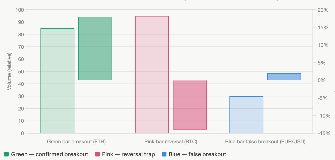
Breakout scenario with green bars: You might see Ethereum consolidate underneath a significant resistance level for an extended period of time (days/weeks) with gradually decreasing volume (lower highs) and brown MFIs, while simultaneously, the price is compressing and appears to be preparing for a breakout. Then, suddenly, you would have three consecutive candles with high volume and rising MFIs, followed by three consecutive green bars. You would then have the classic breakout scenario with an efficient trade that would have a higher probability of being initiated by institutional traders rather than resulting from a retail trader purchasing spike. If traders were watching the MFI for a transition from brown bars to green bars, followed by higher volume, they would be more inclined to take a position in anticipation of a breakout event.
Reversal scenario with pink bars: There was a reversal in Bitcoin's market and a stark increase in value and volume in the previous market. Several pink bars were present in order to represent that the market was experiencing excessive levels of selling, as institutions sold their bitcoins as a means of distributing to the retail marketplace. After the selling is done, retail investors have bought into a higher price and will not have the ability to recoup.
False breakout scenario with blue bars: A clean-looking candlestick breakout on a major currency pair, EUR/USD, above a specific support and resistance level resulted in many traders going long, but when the MFI printed a blue bar, indicating little to no institutional money behind the move, they soon realized the breakout was false, and the price thereafter returned below the previous level, causing many traders to lose money due to their stop positions being triggered. Therefore, traders who used MFI to identify the previous blue bars on the candle to the right would not have traded and instead would have waited for the next clean candles.
Common MFI Indicator Mistakes That Cause Traders to Lose Money
Although the MFI can be helpful to traders in general, it is also possible to misapply the MFI depending on how new you are to volume analysis. Therefore, below you will find some of the common mistakes that new traders experience with other types of volume-based analysis, and how understanding those mistakes can be just as beneficial as understanding MFI signals.
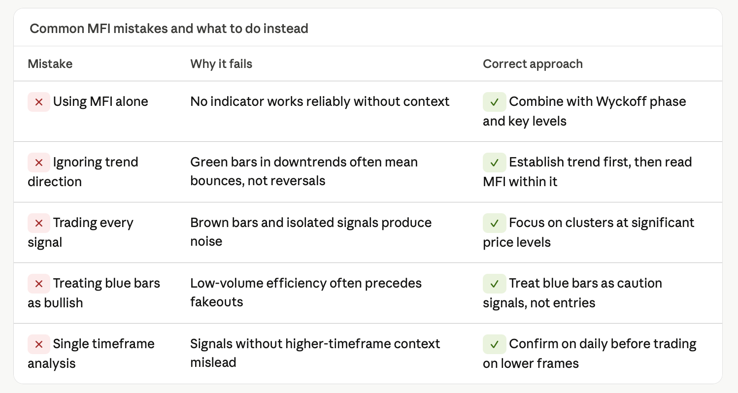
How to Use the MFI: One of the biggest mistakes new traders make with the MFI is using a single MFI colour bar (e.g., pink) as a standalone trade signal. Therefore, a trade signal based solely on one bar (i.e., a pink bar at the top of a chart) is just as meaningless as a trade signal based solely on one green bar (i.e., a green bar at the bottom of a chart). In other words, the MFI indicates whether or not you can confirm or clarify what you see in price and context. If you use the MFI alone to make buying or selling trades, you will end up losing money as a result of the MFI's consistency with the normal price action of a stock or security.
Ignoring the Trend: A green bar printed in a downtrend may be indicative of a temporary corrective bounce before the downtrend resumes rather than a legitimate trading reversal. The MFI does not indicate what trend is present; rather, you provide that analysis to the MFI. Therefore, you use the MFI to time your trades within an existing trend or to determine whether or not there is any continued strength in an existing trend. Skipping this step in your analysis (i.e., not doing a trend analysis) is equivalent to using the MFI to create random buy and sell signals.
Overtrading every colored bar: When MFI shows an overload situation, it doesn’t necessarily translate into an actual trade signal. In fact, brown bars, which indicate a low level of activity, are seldom good for producing profitable trades. Blue bars can frequently precede a fake-out and should cause a trader to use caution instead of acting. There is a true edge when watching for green and pink MFI bars at levels of interest or after confirming Wyckoff Method phases.
Misreading blue bars as bullish: Because price moves efficiently, blue bars can be viewed by many traders as confirmation that the price is moving strongly; however, this is often not the case. Low-volume efficiency frequently indicates that the price move will not hold, especially in the crypto space, where wash traders create false impressions of substantial price moves without actual institutional support.
The answer to all of these mistakes remains the same: utilize MFI as one building block in a larger roadmap to follow, use it with Wyckoff identification, and only take the signals that are in agreement with the trend and at significant price points.
Final Thoughts: How to Master MFI and Trade Like Smart Money in 2026
Volume is a common occurrence among all types of traders. However, while volume is often overlooked by retail traders, it is consistently monitored by institutional traders throughout their trading day. The Market Facilitation Index (MFI) provides an opportunity to bridge the gap between volume and price information by providing a method to represent volume in a way that makes it readable, actionable, and applicable across asset classes and timeframes.
When MFI is used together with Wyckoff Method, the focus becomes less about forecasting where future prices may go and more about determining what is currently taking place with the largest participants in the market: accumulating, distributing, driving a legitimate price movement, or setting a trap for other traders to react if the price moves against them. This shift from reacting to price toward reading what is taking place in the market based on the actions of the largest participants is what establishes a trader’s ability to read rather than react to the market.
The traders who will be most successful in employing MFI and Wyckoff principles in 2026 and beyond will not be the traders who memorize MFI's four exact colors. Instead, the most successful traders will be those who understand the logic behind those signals being colored in those four distinct colors (i.e., volume = effort; price = result; volume + price = intent). Starting there, they would then apply MFI to their charting as an overlay or confirmation tool in combination with the structure provided by the Wyckoff phases to give context to whatever the MFI indicates.
If volume is ignored, then all the trader is doing is reading a record of price without any understanding of who is behind the move.
Looking to use this methodology where it counts? Tradewill provides charting capabilities, volume overlays, and structural market insight so that you can apply the MFI and Wyckoff Method concepts live, as they happen, on any digital currency, FOREX pair, or CFD through a single window with no need to swap platforms multiple times.
Frequently Asked Questions:
What is MFI in Trading?
MFI is a Bill Williams volume-based indicator that identifies how effectively price moves relative to the volume transacted during each interval.
Is MFI Useful in the Crypto Market?
The characteristics of crypto volume and crowded buyer patterns make MFI particularly effective; spikes in volume and patterns of institutional accumulation are far more recognisable and occur with greater frequency than in most other financial instruments. Because MFI is based on Wyckoff Method principles, it is also a very reliable tool for identifying price levels and trends.
Can Beginners Use MFI?
Since the four colors represent signals, MFI is suitable for beginning traders; however, to derive maximum benefit, traders must become familiar with the surrounding context of each signal, such as the pattern of the trend and the significance of a price point in relation to previous price action.
Disclaimer: The content of the blog does not represent any position of Trade W, does not serve as any trading-related decision advice, and does not endorse any third-party.