

 Trade W
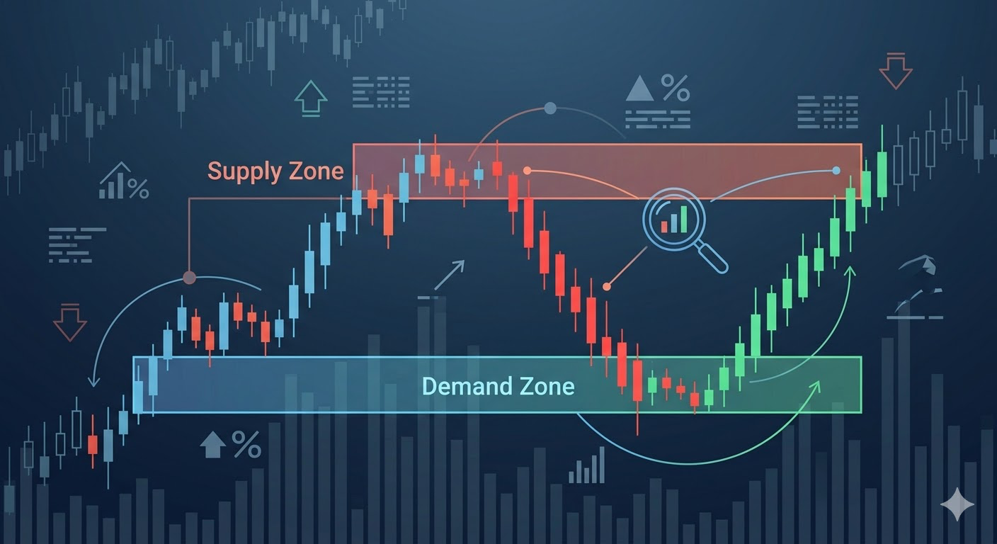
All traders generally have a similar introductory process. Draw a horizontal line to represent where the previous price hit resistance, label it as 'support,' and enter a buy order at that location. Sometimes they get it right, but most of the time they do not. The issue is not with the trader but with the tool.
A price does not respect a horizontal line; however, the price will respect areas where there are lots of institutional orders just waiting for execution.
Traditional support and resistance lines treat price action as if it is simply a single price point on a chart; however, real-world supply and demand come from Institutions buying or selling millions of dollars and placing those funds at a range of prices rather than an exact level and therefore create activity in rectangular zones rather than straight lines.
The rectangular areas where you will find supply and demand, also referred to as supply/demand zones, are the same areas where unfulfilled institutional orders can be found, and those are also the areas of liquidity imbalances, which is where you will find higher reactions from price than any other type of support and resistance level.
This guide will show you how to locate higher quality demand and supply zones in the market, combine that information with order blocks to provide accurate entry points into the market and to be able to identify when a liquidity sweep will occur so that it does not negatively impact your trading account.
Additionally, this guide will teach you how to apply all of this information to the market, including Bitcoin (BTC), Ethereum (ETH), Gold, and Major Market Indices in 2026.
What Is a Supply Demand Zone? The Real Battle Between Buyers and Sellers
Supply-demand zones are the price ranges in which there have been significant imbalances between buyers and sellers.
Demand zones are areas where there is buying pressure that has completely overwhelmed the selling side of the transaction process. Institutions have been adding to their positions at these price ranges. Price moved quickly upwards out of this zone and has not come back to visit them. There are still unfilled buy orders in those demand zones when the price retraces back to get filled.
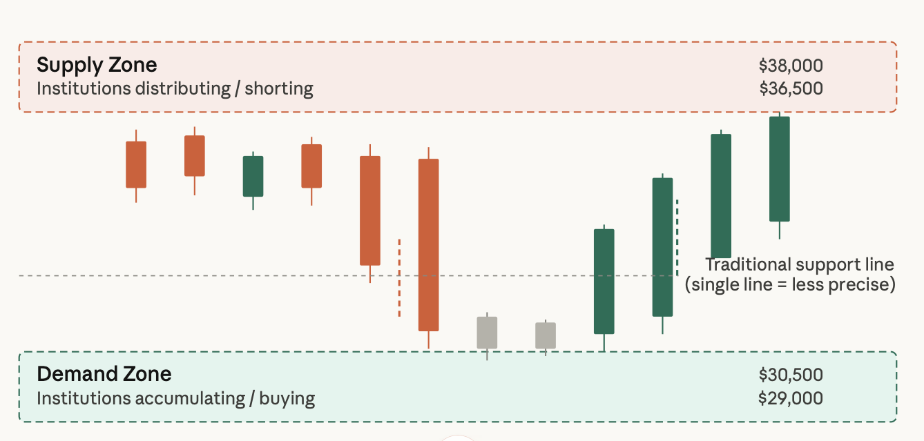
Supply zones are the opposite. Sellers have completely outweighed buyers; institutions have been distributing or shorting at these price ranges, and the price moved sharply downwards out of the supply zone. Every time the price moves back up to the supply zone, there is more supply than there is demand at that price level.
A good way to visualise this would be when a limited release of a game console occurs at $500. As soon as the new consoles arrive, they sell out, and resellers are listing them for $650 each. The $500 price becomes a demand zone. When most of the new consoles are restocked at or near $500, there will be a large number of buyers coming back in to buy.
Using BTC/USD as an example, the price was moving sideways around the $30,000 area. Then, all of a sudden, the price spiked to $36,000 in a matter of a few days. The $30,000 area is now a demand zone. The speed of the move to $36,000 indicates that institutions were filling orders there before the spike, and that a significant amount of those orders sitting at the $30,000 area went unfilled.
The biggest difference between a supply-demand zone and any traditional support or resistance can be visualised and conceptually understood. Zones are depicted as a rectangle and drawn over a price range. Lines are depicted as a single horizontal line drawn through the price range.
Zones allow for the fact that institutions do not fill all of their orders at one specific price; they will fill their orders across the range of prices. Your analysis, therefore, should be performed as institutions fill their orders.
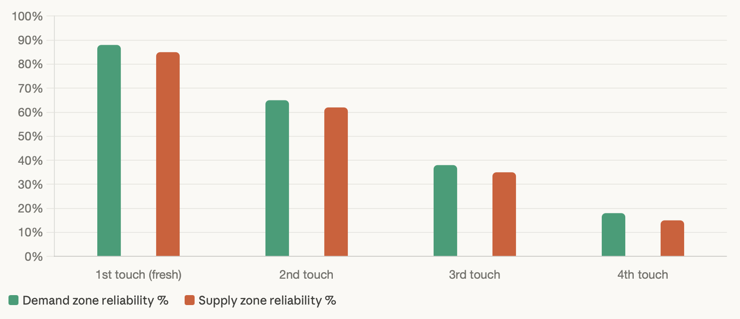
The only principle you need to pay attention to here is that the first touch onto a fresh supply-demand zone will generally present the highest probability of success. As the price touches the supply demand zone an increased number of times, it lowers the likelihood of the supply demand zone still having unfilled orders in it.
By the third or fourth touch, you are no longer trading from institutional demand; you are trading a supply-demand level that the majority of the market is watching and therefore worn out.
Demand Zone vs Supply Zone: How to Spot High-Probability Reversal Areas
Understanding what the various zones mean is only part of the equation; being able to identify them on a live price chart is an entirely different aspect.
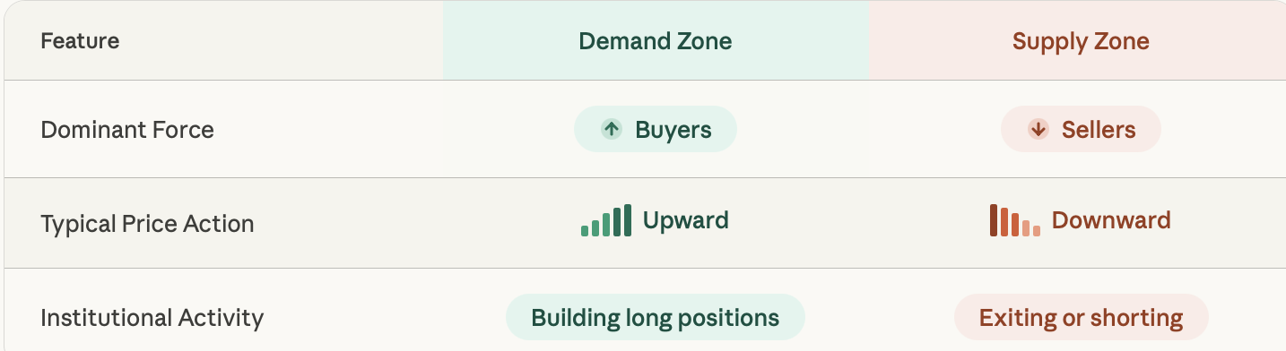
Demand zones typically represent areas where buyers are accumulating positions, thus creating upward price movement from those zones. After a relatively short period of time in a consolidation pattern, expect a subsequent sharp upward movement from the demand zone.
In general, it is the combination of a tight base prior to the breakout and an aggressive exit from the base that constitutes institutional buying activity.
Supply zones usually represent areas where sellers are liquidating or entering short positions. Consequently, price movement from these zones typically results in downward movement. The construction of supply zones mirrors the construction of demand zones, but in the opposite direction.
As with demand zones, after a relatively short period of consolidation, there is expected to be a sharp decline in price movement from the supply zone - often without no warning.
Here's a quick breakdown of how they differ:
An example of this can be found in ETH's price when it was at 1800 dollars. After ETH traded at that price for a short period of time and then moved to 2100 dollars, the old price of 1800 became a "demand zone" that traders who were aware of it could take advantage of by buying. The trader had clear defined risk and a target that allowed for a good reward-to-risk ratio to enter the trade.
On the equity side, supply zones continue to be created at the psychological highs of the DJIA. When the market retraces back into these supply zones after running up for an extended period of time, sellers will return to the market and sell down the price. The occurrence of these two events happening together is not a coincidence, but rather occurs due to institutions managing their positions using very defined price ranges.
Many traders confuse heavily tested prices with good supply/demand zones. If a zone has been hit five times, it is weaker than if the zone had only been hit three times, because most of the orders have already been filled on the five hits.
How Supply and Demand Zones Are Formed: Understanding Institutional Behaviour
Zones aren't created at random; their formation is a direct result of a defined pattern of events surrounding the order flow of institutions.
When there are significantly more buy orders than sell orders at a particular price point, this causes prices to move quickly upward to find new sellers, and the quick movement of price is what signals that there is more demand at that price point than there are orders available to be filled. Therefore, some of the buy orders were probably unfilled or partially filled when the price moved higher.
Supply zones work the opposite way, and price drops quickly when institutions have placed more sell orders than there are available to buy.
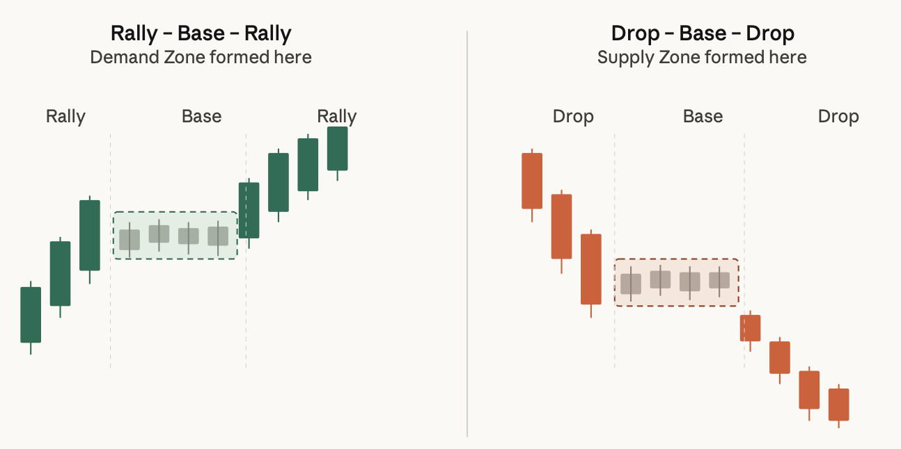
This creates what traders call a three-phase structure known as Rally-Base-Rally, or Drop-Base-Drop.
A Rally-Base-Rally makes for a demand zone with price rising and then having a very short consolidation period in a narrow range before moving up again. The area where the base occurs is where there was an institutional accumulation of contracts.
A Drop-Base-Drop makes for a supply zone with price dropping, then having a period of consolidation before moving down again, and where the base occurred is where there was institutional distribution of contracts, resulting in short entries.
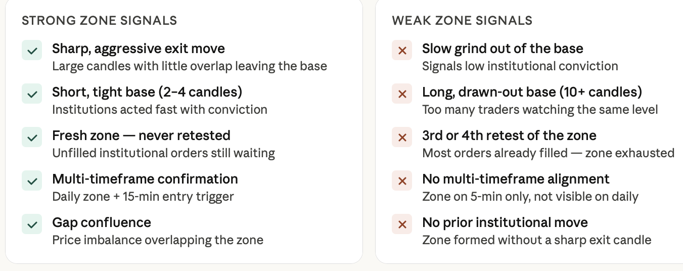
The base phase is critical because if the base is short, it indicates that institutions acted quickly and with conviction. Conversely, if the base is long and drawn out, it indicates a lack of conviction and a less robust zone. In addition, the ideal exit from the base is one that is sharp and clean; this is an important characteristic of institutional behaviour.
XAU/USD was a clear example of this behaviour in the amount between $1,800 and $1,850 in periods of uncertainty regarding interest rates. Price would trend sideways for a very short time in those price ranges before making a clearly defined move, resulting in well-defined zones on which traders could rely for future tests of those price levels.
How to Identify High-Quality Supply and Demand Zones
In the world of trading, it is important to distinguish between the different types of zones. There are three main characteristics that determine whether a zone is high probability or weak.
The first characteristic is the strength of the move away from the zone. The stronger and more aggressive the move away, the greater the likelihood of institutional involvement in the zone. A strong move will typically appear as a sharp candle or series of candles with very little overlap. Conversely, a slow grind out of a zone typically indicates that there was not much institutional involvement.
The second characteristic is the duration of the base. Bases that are short in duration are stronger than bases that are long in duration. The fewer candles there are in the base, the more likely institutions are to be involved quickly and therefore have a higher degree of conviction in their orders at that price.
The third characteristic is the freshness of the zone. If a zone has not been retested since it was created, it can be considered more reliable than a zone that has been tested several times. When the price tests a zone, orders are filled, and any imbalance in ordering diminishes.
A fourth characteristic is multi-time frame confirmation. When looking for major zones on the daily time frame, then moving to the 15-minute time frame to look for entry signals, e.g., Bullish Engulfing candle or Hammer candle within the zone. The daily chart can give you the overall context of a trade while the 15-minute chart provides precise trading entry points.
Another characteristic of strong zones is that they are often confluent with price gaps. The presence of a price gap where there was an imbalance between buy and sell orders means the price has moved quickly through that area without any transactions taking place. Thus, many times the price will gravitate to these areas again in future trading periods.
When combining these filters, you have one of the cleanest trade setups possible: a fresh demand zone on a daily chart, a short, solidified base, a strong exit candle, and a 15-minute Bullish Engulfing confirmation. The $1800 level for ETH is an example of this setup, providing you with all the required criteria before the price surged to $2100.
Mastering Order Blocks for Precise Entries
In order to find the best opportunities to trade, you can use the supply and demand zones as a map and the order blocks as the "X marks the spot."
Order blocks are the last institutional candles prior to a strong directional movement. They exist within a supply or demand zone and indicate where institutions have placed their most recent significant orders. An order block represents the area of highest density of institutional activity at a particular price level within a larger area of activity by institutions.
In the case of demand zones, the last bearish candle prior to the large rally is your order block. When price retraces into the demand zone, the order block is your best entry point out of the demand zone and into a bullish movement.
The converse is true for supply zones. The last bullish candle before the large move down would be the order block where institutions were selling into the strength.
To give you an even better advantage, consider multi-timeframe analysis to determine the order block and supply and demand zone using the daily time frame. When you determine where the zone is and the general location of the order block, switch to the 15-minute time frame for your actual entry signal. A bullish engulfing candle that forms at the order block level in the daily demand zone is considered a very high-probability setup with small, properly-defined risk.
The addition of gap confluence further strengthens this setup. When you have an order block and a gap that aligns, you have two reasons for the price to react at that specific area.
Having a demand zone with an order block and a confirmation from the 15-minute chart is what distinguishes reactive trading from precise trading. You are not making a guess that prices may bounce at a particular price level. You are identifying where institutions placed significant buy or sell orders and entering as close to those orders as you can.
Risk Management: Avoiding Liquidity Traps
You can have an impeccable zone setup, but if you don’t understand how the Institutions look for Liquidity, everything may go wrong.
A liquidity sweep is when the price breaches either a Demand Zone or a Supply Zone momentarily. This breach below the Demand Zone and above the Supply Zone activates retail stop losses and then sharply retraces back to the original range.
The reason Institutions benefit from liquidity sweeps is that the stop losses become the liquidity that they use to execute their orders at a better price.
To illustrate this example, imagine the price approaches a very well-known demand zone. Retail traders enter a buy order in anticipation of being filled at the demand zone. They place stop orders directly underneath the zone. When the price briefly trades below the zone, retail traders’ stop orders get hit. After executing their orders, the price meets the demand zone and then rockets higher. Those traders didn’t get the opportunity to participate in the move up because they were stopped out prior to the overall move up.
To identify liquidity sweeps and back away from being trapped, you must check the price action following the breach. If you see a sharp, quick reversal back into the zone, you can reasonably deduce that the break below was a sweep, and thus not a genuine breakdown. You should look at several supporting volume and sentiment indicators, such as the Put-Call Ratio (PCR); if you see a large number of puts being purchased just before a liquidity sweep into a demand zone, then it confirms there was fear from Retail Traders being harvested.
When placing your stops, do not place your stop loss right at the edge of the zone. If you do, that is precisely where the sweep will occur. Make sure to place your stop below the liquidity void that is below the zone. This allows your trade to remain in a position for a small swee,p but still exit your trade ifite breaks down into further price action.
An excellent example to examine to illustrate the above liquidity sweep is the behaviour of BTC/USD around the Demand Zone of $30,000. The price momentarily traded below the zone, hit the stop orders of sellers, and then promptly rallied back to $32,000. Therefore, traders who placed their stop loss below the sweep level remained in the trade, whereas those traders who placed their stop at the edge of the demand zone were "flushed out".
Macro Trading in 2026: CPI, Gold, and Indices Through a Supply and Demand Lens
There are no technical zones that are individual. Macro data has developed increasing amounts of demand and supply zones in record time in 2026.
When the Consumer Price Index (CPI) is announced, it creates enormous volatility spikes, which produce new zones in real-time. When the CPI number is above the expectation, or below the expectation, institutions will adjust their positioning quickly, which produces new demand and supply zones and will remain in the market for many weeks.
Gold (XAU/USD) is a very clean asset to trade in terms of demand and supply zones. During periods of safe-haven accumulation, there are several psychological levels that act as natural demand zones; two of those levels are $2,000 & $2,200. Institutions build long positions on these levels, which would make them an excellent area for traders to identify how institutions are behaving.
The Dow Jones Industrial Average (DJIA) & many other indices regularly create supply zones at all-time highs, or after extended uptrends, and when the price retraces back into those zones, especially in times of uncertainty in macro data, institutions will typically sell into distribution, thus producing substantial pullbacks.
For traders looking for blue chips in the Nifty 50 index, zones can be an advantageous method to trade. Strong demand zones on leading sectors, very often, will coincide with wider index demand or accumulation phases of the market, thus allowing traders to gain an advantage on the change of institutional positioning.
This is where the Point of Interest (POI) concept can be beneficial to traders.
Advanced Concept: Point of Interest (POI) in Trading
A Point of Interest (POI) is a price level that has gained significance due to an institution's involvement at that price level or area of supply or demand.
Incorporating order blocks, structural levels, and zones of supply and demand into one area creates a POI. When multiple factors come together to produce a price point or range, that location should be given additional consideration when making investment decisions. It should not be assumed that the price level or area of supply/demand is a POI simply because it is a zone; the absence of any added confirmation means it may not qualify as a POI.
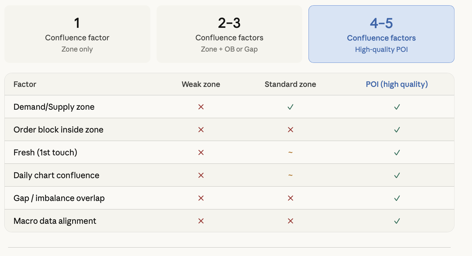
To avoid making impulse purchases or sales at weaker zones, POIs will provide an investor with the ability to filter out weaker zones, enabling them to make an informed investment decision by focusing their trading on those zones where institutional footprints are evident. An investor should make their purchase or sale decisions based on their POI and at-risk reward ratio of the trade.
A macro trader that uses CPI data when evaluating XAU/USD would consider a demand zone for gold that also aligns with an order block and the existence of an accumulation base before the CPI date that supports the establishment of this zone to be a high-quality POI. The macro trader is not simply speculating; they are armed with evidence to support their trading proposition.
FAQ
What is a supply-demand zone?
A supply-demand zone is a price area where a significant imbalance between buyers and sellers occurs, typically driven by institutional order activity. Demand zones attract buyers. Supply zones attract sellers.
How do demand zones differ from supply zones?
Demand zones form where buying pressure exceeded selling pressure, and the price rose sharply. Supply zones form where selling pressure exceeded buying, and price dropped. The institutional intent is opposite in each case.
How do I identify high-quality supply and demand zones?
Look for a strong, fast move away from a tight base, a fresh zone that hasn't been retested multiple times, daily chart confirmation, and a 15-minute entry trigger. Gap confluence adds extra reliability.
What is an order block, and how is it used?
An order block is the last institutional candle before a major directional move, sitting inside a supply or demand zone. It marks the most precise entry point within the zone.
What is a liquidity sweep,p and how can I avoid it?
A liquidity sweep is when the price briefly breaks a zone to trigger retail stops before reversing. Avoid it by placing stops below liquidity voids rather than at the zone edge, and confirm reversals with sentiment tools like PCR.
Can supply-demand zones be applied to crypto?
Absolutely. BTC and ETH are among the best assets for zone-based trading because institutional activity creates clean, well-defined zones that often retest predictably.
Ready to start marking these zones on real charts? Head to TradeWill.com and use the charting tools to draw your demand zones, supply zones, order blocks, and POIs directly on live crypto, forex, and index charts. Stop guessing where the price will go. Start reading where the institutions already are.
Disclaimer: The content of the blog does not represent any position of Trade W, does not serve as any trading-related decision advice, and does not endorse any third-party.