

 Trade W

Countless traders have dedicated significant amounts of time and energy to fine-tune their trade entry alerts, improve their trade indicators, and run what's called 'back testing' against their trading strategies, yet many of these traders lose money on trades even though their analysis told them they were correct about the direction the market would move in.
Such a situation can be one of the most aggravating situations for traders, and virtually every one of these instances can be connected to a time-frame error, specifically, the time frame used to analyse the market.
A second key aspect that distinguishes successful traders who analyse the markets accurately from unsuccessful traders who only view one aspect of price movement on a single time frame is called multi-timeframe analysis. In this book, we will provide an integrated approach to time-frame analysis and use real examples to illustrate how these trading disciplines apply to six different instruments: foreign currency exchange, digital coins, and commodities.
What Is Time Framing in Trading?
An example of time-framing is to study and analyse only a particular set of time frames on charts to identify how the price is behaving at different levels of market activity. Every time a candlestick appears on a chart of prices, it indicates a time period. Therefore, the type of interval you select from will determine the specific group of instruments that you are tracking.
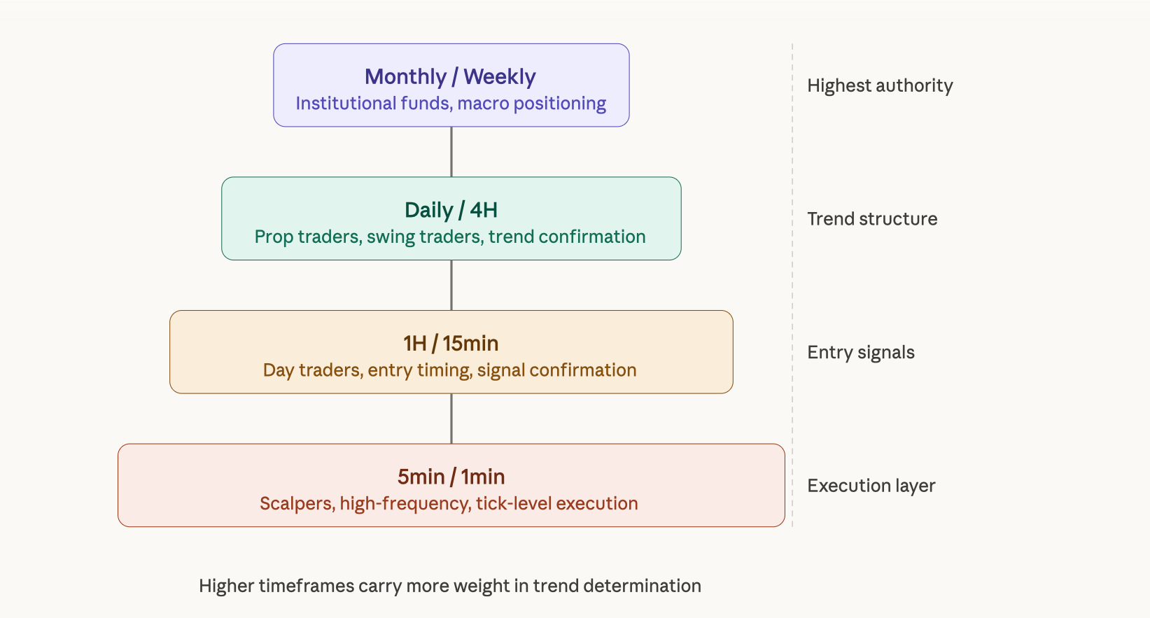
Charting every month enables you to see the way institutional fund managers place their trades for weeks or months at a time. A chart done on a five-minute basis captures how scalpers respond to a news event.
Both of these groups of traders have their own methods of establishing positions within the same marketplace, and understanding the differences between them is essential to successfully analysing price movement.
The different types of charts used by professional traders include Monthly Charts, Weekly Charts, Daily Charts, 4 Hour Charts, 1 Hour Charts, 15 Minute Charts, 5 Minute Charts, and 1 Minute Charts. These charts may each serve a different purpose, while each chart is valuable in its own right, none conveys the entire picture.
The Core Logic of Multi-Timeframe Analysis
The basic principle behind Multi Timeframe Analysis is simple: The trend on the highest timeframe determines what the market is doing overall. The mid-timeframe confirms that trend’s structure. The lowest timeframe provides the point of entry for trades. When all three of these timeframes are lining up, the chances of a successful trade are greatly increased.
A good analogy for how these timeframes work together is to view them as a GPS unit. The satellite view shows the entire route and overall destination, the city map shows which streets to travel, and the street-level view shows exactly where and when to turn. If you relied solely on the street-level view to navigate, you would have each turn correct but could end up completely disoriented.
The same applies to trading as well. For example, you could look at a 15-minute chart and see a perfect Bullish reversal formation that has every single classic bullish confirmation, including a double bottom, breakout through resistance levels, and increasing volume.
However, if the daily chart is currently in the middle of a bear trend and the 4-hour chart hasn't generated a structural break yet, the possibility of that 15-minute signal being successful is very low. The trader who takes that trade would not be incorrect about the technical setup, but rather be incorrect with regard to the overall context.
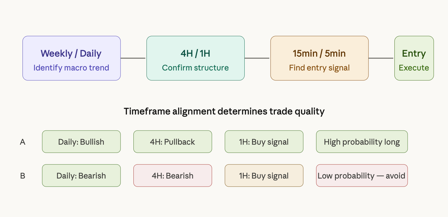
The confluence trade is represented in row A of the above chart. Row B shows an example of the most common retail trading trap - where traders buy based on a 1-hour timeframe when the daily and four-hour timeframes still indicate a downtrend. This looks like a great entry point with good patterns.
However, the buyer is basically trying to fight the trend and against the higher timeframes, which typically results in losing, as the higher timeframe players will ultimately prevail.
How to Combine Monthly, Daily, and Intraday Charts: A Step-by-Step Workflow
The practical application of multi-timeframe analysis follows a top-down sequence. You always start from the highest relevant timeframe and work your way down to the entry level, never the other way around.
Step 1: Monthly and Weekly Charts
Establish the Macro Trend: The application of multi-timeframe analysis begins with a broad, high-level view of price movement and works towards finding specific entries. Using the monthly or weekly chart gives traders an idea of whether the price is moving up, down, or sideways. Therefore, by using moving averages (i.e., 20 and 50 Period MAs), traders will be able to determine where the price is within its overall trend.
Step 2: Daily and 4-Hour Charts
Identify Market Structure: Having established the macro-trend on the monthly or weekly chart has already been established, traders will then use the Daily and 4-Hour Charts to determine what stage of the broader trend the market is in; is it pulling back, forming a consolidation near a key support or resistance area, or has it broken out structurally and is signaling that it will continue to move upwards or downwards? By identifying these opportunities, traders can locate their potential trade zones.
Step 3: 1-Hour and 15-Minute Charts
Find the Entry: Finally, traders will use the 1-Hour and 15-Minute Charts to find their exact entry point. This could include candlestick patterns, RSI divergence, breakouts from smaller consolidations, or bounces from a level of support. Whatever the entry trigger is, it must always align with what the traders have already determined from the higher timeframes to be true.
Step 4: Risk Management and Execution: After determining both the entry points and the way to manage the associated risk, traders should not place their stop losses based on an arbitrary number of pips. Instead, they should be placed according to the structure.
For example, for long trades, stops should always be placed below the most recent swing low based on the mid-term timeframe. Traders will then size their positions according to both the distance to the stop being used and their risk percentage per trade in relation to their overall trading capital.
Win Rate and Risk-Reward Impact: Why Multi-Timeframe Analysis Works
Multi-timeframe analysis has a strong statistical foundation. Higher timeframes act as a filter for traders by confirming potential trade entries based on lower timeframes. The result is that most of the trades made have a higher likelihood of winning than those trades where no additional confirmation was used. Therefore, filtering trades with higher timeframe confirmation will increase the likelihood of success and increase the risk-to-reward ratio associated with all closed trades.
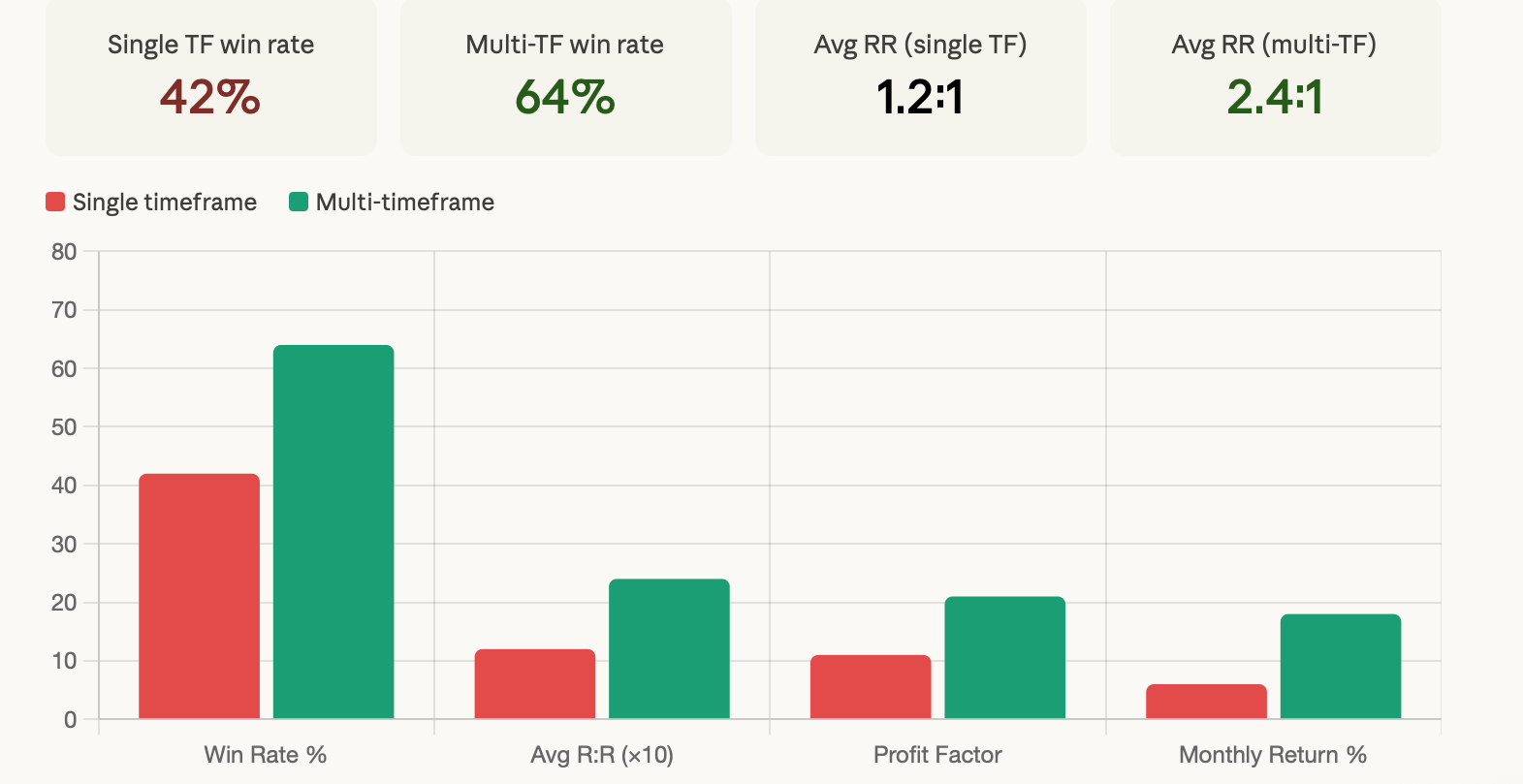
The increased ability to compound earnings on an improved risk-to-reward ratio is of paramount significance as it allows traders to achieve long-term success through the accumulation of capital over time.
For example, a trader's risk/reward ratio will increase with a higher percentage of winning trades, allowing the trader additional opportunities to maintain a long-term positive return on investment, with the potential for larger swings that may result in greater losses and funds left in their trading account by other traders due to not being able to overcome loss after loss due to low-risk/reward ratios.
Additionally, having a multi-timeframe confluence eliminates the chance of emotional interference during fluctuations caused by entering a trade based on a clear, logical reason based on multi-timeframe analysis, which will minimise the likelihood of emotional bias influencing the trader's decision-making process to hold trades through normal fluctuations without fear of losing money due to prematurely exiting the trade.
Practical Case Studies: Multi-Timeframe Analysis in Real Markets
Case Study 1: Gold (XAU/USD): The Classic Top-Down Trade
Analysis of gold's trends is a prime example of using mixed-methods multi-time frame analysis because the types of trends that you see are consistently and clearly identifiable across all time frames, including short-term, intermediate-term, intermediate term and long-term.
The monthly chart for gold clearly demonstrates an upward trend with prices reaching new highs and higher lows consistently above the 20-month moving average. Therefore, the primary direction of the market is being driven by buyers at the highest available level with regard to monthly charts.
When you switch over to the daily chart of gold, you will see that the price of gold has fallen back down to where a previous support level was the 50-day moving average and is currently testing a previous area of support. The current price movement appears to be corrective rather than impulsive, which means that it is moving upward, but at a more orderly pace than would be expected, and not breaking downwards through the previous areas of support.
On the 1-hour chart of gold, a bullish engulfing bar has developed at or below the previous support level. Also, there has been a divergence between the price and the RSI (ie, the price made a lower low than it made previously while the RSI created a higher low). Since all three time frames are showing the same trend, the price has pulled back to a logical support area, and a reversal signal has formed; therefore, this creates a strong potential long position entry.
Case Study 2: BTC/USD: When Timeframes Conflict
In the case of Bitcoin, where the current week's charts are displaying a large decline in price, the analysis indicates that the daily chart is indicating a potential bullish reversal. The hourly chart indicates that the price has formed a small bullish flag pattern. Therefore, a trader examining only the hourly chart would have seen a potential clean long trade and accepted it as such.
When a trader looks at the same hourly chart from a multi-timeframe perspective, he can see that the current daily and weekly charts are opposing the current trade setup. Thus, while the hourly flag can potentially indicate that there is a short-term bullish reversal underway, the larger weekly trend is still bearish.
Therefore, the hourly breakout should be viewed as a temporary corrective bounce within a larger bearish trend. As such, the trader would not want to enter the breakout from the flag, as it is very likely to get caught in the larger downward move once the short-term bullish move reverses.
The Most Common Mistakes in Time Framing
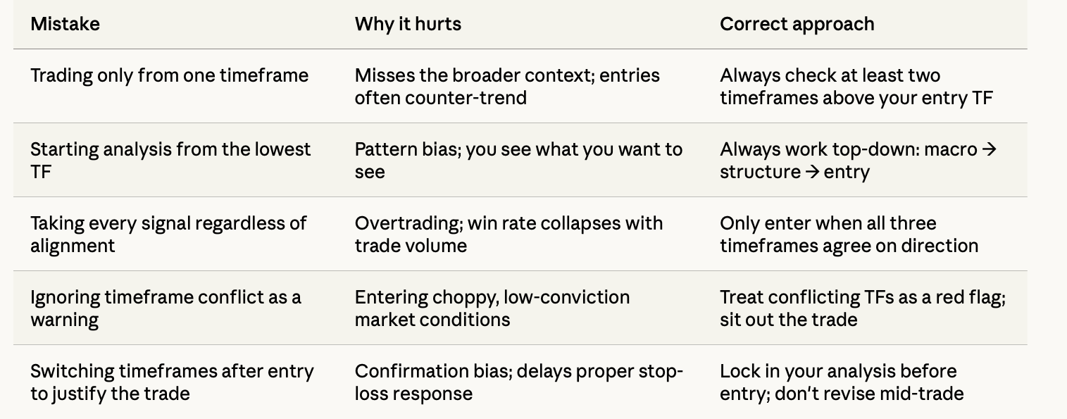
One of the critical errors listed above occurs behind the scenes; it is not visible to most traders. In the example given, after entering into a trade where a loss occurs, the trader switches from using the 1-hour chart to the 4-hour chart. The trader will find "reasons" to remain in the position.
This action does not represent any form of analysis; it instead represents a rationalisation as to why the trade should still be held onto despite being in a losing position. The only analysis that matters is the pre-entry analysis. The discipline to commit to this analysis before placing the order is what separates the systematic trader from the emotionally driven trader.
A Breakdown of Timeframe Reliability by Market Condition
The performance of a given time frame will vary depending on market conditions. Hence, a trader needs to understand which timeframes are better than others when the market is trending, ranging or experiencing extreme volatility in order to appropriately align his analysis with those market conditions.
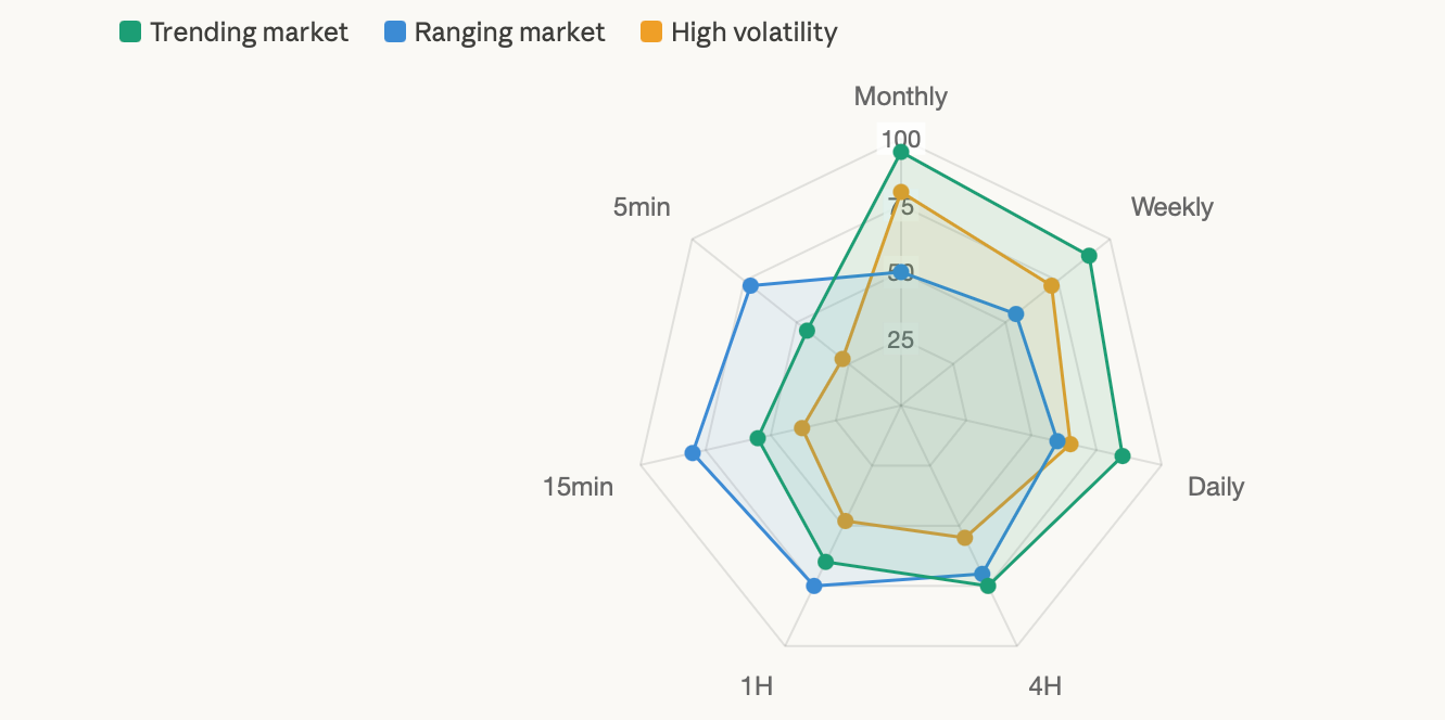
The dominance of momentum in a trend market makes a higher time frame more reliable than lower time frames. Conversely, due to price oscillation between defined support and resistance, the market structure of shorter time frames becomes increasingly valuable in a range-bound market.
During high volatility events like major economic announcements, the reliability of higher-time-frame charts is maintained, and the reliability of lower-time-frame charts diminishes due to excessive noise, making them less useful for determining entry timing.
How to Apply Multi-Timeframe Analysis on TradeWill
The TradeWill Multi-Chart layout allows you to monitor multiple timeframes at a glance without having to switch back and forth between charts. You can create a workspace with your daily, 4-Hour, and 1-Hour charts displayed at once, for example, which allows you to do a complete top-down analysis in real time without having to lose your position.
An example of how a Swing Trader would set up TradeWill for Forex trading could be as follows: Page 1 would have the Daily chart pinned on the left for trend reference. Page 2 would have the 4-Hour chart in the centre for structure identification, and Page 3 would have the 1-Hour chart on the right for monitoring entry. The 20 and 50 MA's applied to all three charts would give immediate insight as to whether or not the price is currently above or below the trend reference at any given level of the market.
For Crypto traders who are tracking a variety of assets all at once, such as BTC, ETH and Gold, the TradeWill layout allows them to conduct full Multi-Timeframe analyses on the same screens without the added cognitive strain of constantly switching charts.
Your analytical process must be consistent; consistency is just as important as the quality of your analysis, and a consistent workspace capable of meeting your workflow helps to alleviate decision fatigue during the actual trading sessions.
Frequently Asked Questions
What is time framing in trading? Time framing refers to selecting specific chart intervals to analyse price behaviour at different levels of market activity. It's the practice of understanding how markets look across multiple timeframes before making trading decisions.
What is the best timeframe for day trading? Most professional day traders use a combination of the daily chart for context, the 1-hour chart for structure, and the 15-minute or 5-minute chart for entries. There's no universally best timeframe, because the optimal choice depends on your trading style, the asset, and the market conditions.
How do I use multi-timeframe analysis? Start from the highest relevant timeframe to identify trend direction, move to the mid timeframe to confirm market structure and find trade zones, then use the lowest timeframe to identify specific entry signals that align with the higher timeframe direction.
Is multi-timeframe analysis suitable for beginners? Absolutely, though beginners should start with just two timeframes rather than three or four. A solid starting point is the daily chart for trend direction and the 1-hour chart for entries. Adding more timeframes should come after the two-timeframe approach becomes intuitive.
How does time framing improve trading accuracy? By filtering out low-probability signals that go against the higher timeframe trend, multi-timeframe analysis reduces the number of bad trades you take and improves the quality of the trades you do take. It also provides a clearer context for stop-loss placement and profit targets.
Related Trading Resources on TradeWill
There is extensive material available through TradeWill's resource library for traders to learn about the concepts discussed within this guide. These resources include complete forex trading strategy frameworks, detailed guides covering each aspect of using technical analysis in their trading, such as support/resistance levels, moving averages, and RSI calculations, along with separate resource guides dedicated to gold and cryptocurrency trading workflows that incorporate multiple timeframe analyses into their strategies.
Ready to put multi-timeframe analysis to work? TradeWill's multi-chart workspace lets you run your full top-down analysis without switching tabs, so your next high-confluence setup doesn't slip by while you're searching for the right chart. Open your TradeWill account at tradewill.com and set up your first multi-timeframe workspace today.
Disclaimer: The content of the blog does not represent any position of Trade W, does not serve as any trading-related decision advice, and does not endorse any third-party.